
Building long-form content for the web: Use space wisely
The first area to consider is how we use the space on the page. Because we have different screen sizes and resolutions, we have to be mindful of how we organize the space.
Content width #
One of the biggest issues with working with long-form content is how many characters wider should we go?
According to the The Elements of Typographic Style Applied to the Web the optimal measure (length of a line) is between 45 and 75 characters.
We will have problems if the line is too long or too short. According to the Baymard Institute:
If a line of text is too long the reader’s eyes will have a hard time focusing on the text. This is because the line length makes it difficult to gauge where the line starts and ends. If a line is too short the eye will have to travel back too often, breaking the reader’s rhythm. Too-short lines also tend to stress readers, making them begin on the next line before finishing the current one (hence skipping potentially important words).
Until recently it was impossible to create a measure based on character count. We couldn't say the width of this paragraph is 75 characters. CSS Values and Units Module Level 3 introduced the ch unit of measurement that addresses this issue. It is defined as:
Equal to the used advance measure of the "0" (ZERO, U+0030) glyph found in the font used to render it. (The advance measure of a glyph is its advance width or height, whichever is in the inline axis of the element.)
They go on to explain that:
The advance measure of a glyph depends on writing mode and text orientation as well as font settings, text transform, and any other properties that affect glyph selection or orientation.
We can use it to say that the body text is 75 characters wide with the following CSS:
.content {
  width: 75ch;
}
With this rule, we guarantee that the width of the content will be 75 characters. However, one important thing to consider is that the width of the "0" (ZERO, U+0030) glyph will be different based on the font you use and the direction of your text. This may mean you will have to adjust the line height and other typographical elements of the page.
Using ch as the unit for our measure we can get consistent width for the content.
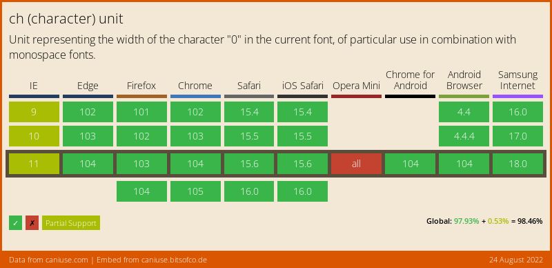
Support is pretty good, with Opera Mini being the only browser that doesn't support the unit.
Line height #
“Vertical space is metered in a different way [to horizontal space]. You must choose not only the overall measure – the depth of the column or page – but also a basic rhythmical unit. This unit is the leading, which is the distance from one baseline to the next.” Source: Choose a basic leading that suits the typeface, text and measure
In addition to measuring the width of our content, we need to also account for vertical spacing between the lines of our text. This is called Leading (pronounced “ledding”), a byproduct of mechanical presses, where strips of lead are placed between lines of type to space the lines apart.
Four web content, we control leading via the line-height property. The following example will produce a separation of 1.5 units between lines in paragraphs:
p {
  line-height: 1.5;
}
However, there is a little trick that I have to remind myself of constantly. CSS adds half the value of the line-height attribute above and below the line it applies to. Otherwise, we would get double our desired value.
The preferred way to use line height is with unitless values (like 1.25 or 1.5). The used value is this unitless number multiplied by the element's own font size. The computed line height value is the same as if we specify a length (like 15px or 2em).