
Getting fancy: CSS Transformations
One of the most intriguing things we can do with text is change its position and the way it looks on the screen with nothing but CSS in browsers that support it. The good news is that all browsers except IE8 and Opera Mini support transformations so we won't have to do workarounds.

We'll start with rotating the header of our content 90 degrees and move it down the column.
It looks good but I think it can look better. When we move it sideways the text looks very small and when we make the font larger it forces the text into 2 rows... and that's not what I want... I want the larger text to stay in one column.
What I realized was that I had to change the design. Rather than keep the heading inside the content area, it would work better if we move the h2 element outside the content area and style it separately.
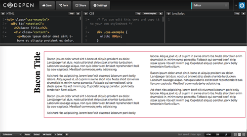
Transformations are very dependent on the dimensions of the content you're working with. The codepen below shows the heading in the smallest media query I set up for the demo (800px wide). The heading is not rotated but displayed in above the text as in a regular page.
But if you look at a screenshot below, you'll see what the code work when you set the screen as wide as possible.
Media queries would be the best solution to accommodate for all screen sizes. You will have to decide if Media Queries and Vendor prefixes is worth the effort and how many media queries you would have to create for your code to look good in your target device(s). It's not a perfect solution, it requires tons of work and needs to be adjusted for all your target breakpoints and devices.
This is just the beginning of what you can do. Mozila Developers Network (MDN) provides a very good overview of CSS transformations to show what you can do.
Because this is dependent on screen resolution (when is a pixel is not a pixel) you must test in your target devices. Also : Just because you can it doesn't mean you should. As great as transformations are they take time and may detract from your audience's attention.
Links and Resources #
- CSS Transform (MDN)
- Using CSS Transforms (MDN)