
Exploring the picture Element
The picture element was added to the HTML specification as part of the responsive images effort.
This post will dive into the picture, source and img elements along with the srcset property and explore how we can use them to create responsive images in different scenarios.
At its simplest, picture is a wrapper for images created using the img element.
<picture>
  <img src="image.jpg" alt="A description of the image.">
</picture>
What we're more likely to see is one or more source child elements.
<picture>
  <source srcset="image/surfer-240-200.jpg" />
  <img src="image/surfer-240-200.jpg" alt="Image of a surfer" />
</picture>
The source element is similar, but not identical, to what we use in video and audio elements. It uses srcset instead of src to indicate the images we want to load.
We will now look at some use cases for responsive images using picture elements.
Offering alternative image formats and speeding page load times #
The simplest use case for the picture element is to provide different image formats for the browser to choose from.
This can be used for two purposes:
To provide newer formats for browsers that support them.
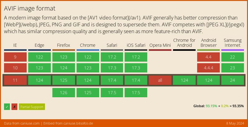
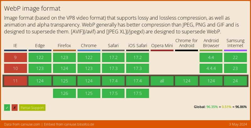
AVIF and WebP are supported in all major browsers
HEIF is only supported in Safari
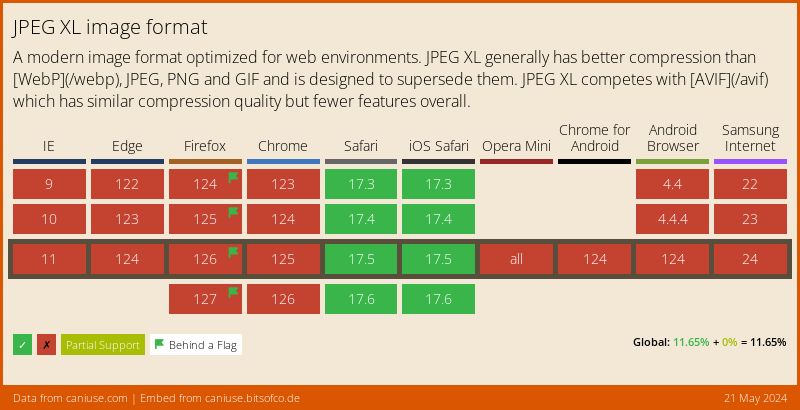
JPEG XL is fully supported in Safari and behind a flag in Firefox
Newer image formats offer better compression and smaller file sizes at the same quality. In providing these smaller files you may also make the page load faster.
In this example, we have two source elements loading an AVIF and a WebP version of the image. The default img element will render for browsers that don't support either format.
Current versions of browsers will load the AVIF image.
<picture>
  <source
    srcset="image.avif"
    type="image/avif">
  <source
    srcset="image.webp"
    type="image/webp">
  <img src="image.jpg" alt="A description of the image."
    width="300"
    height="200"
    loading="lazy"
</picture>
As with the source for video and audio elements, order matters. Browsers will use the first format they support and discard any other source element inside the picture.
If we flipped the order of the source elements then current browsers would load the WebP image, even if they also support AVIF.
<picture>
	<source
    srcset="image.webp"
    type="image/webp">
  <source
    srcset="image.avif"
    type="image/avif">
  <img src="image.jpg" alt="A description of the image."
    width="300"
    height="200"
    loading="lazy"
</picture>
Art direction #
Art direction is, to me, the most complicated use case for responsive images.
It involves multiple issues that we have to deal with, for example:
- Resizing images based on viewport size
- Cropping images based on viewport size
- Handling high DPI devices
- Combination of the above three cases
- Combination of art direction with format delivery
Handling Different Image Sizes #
There are two ways to control the size of an image.
The one uses the size of the viewport to indicate which image to use and it's controlled using media query syntax
If the viewport is larger than 75em the browser must display the large image.
If the viewport is between 40 and 75em the browser must use the medium image.
Otherwise, the browser must use the small image contained in the img element.
<picture>
  <source
    srcset="images/mountain-large.avif"
    media="(min-width: 75em)">
  <source
    srcset="images/mountain-medium.avif"
    media="(min-width: 40em)">
  <img
    src="images/mountain-small.avif"
    alt="A description of the image." width="300" height="200"
    loading="lazy">
</picture>
You can also use the srcset attribute of the source and img elements to further control the size of the image displayed to the user.
In addition to the media query, we can add additional images to the srcset along with an indicator of the width for each specific image.
Using the w indicates that the image matches a given size, giving browsers another indicator of what image to match for a given width and is more specific than the media query attached to the srcset element.
If we use the w attribute then we must also add a sizes property.
In this case, we want all images to be at full width so we're ok with using 100vw as the value for sizes.
There is a lot more than we can do with sizes and the w attribute but I don't want to dig too deep into it since it would make this post too long.
- The first
sourceelement, the content matches if the viewport width is 800px or larger. - If the viewport width is 800px then we use the first image (indicated by the
800wvalue) - If the viewport width is 1600px or larger then we use the second image (represented by 1600w value)
- In the second
sourceelement, the content matches if the viewport width is 600px or wider. - If the viewport is 600px or larger then use the first image listed.
- If the viewport is 1200px or larger then use the second one
<picture>
  <source
    media="(min-width: 800px)"
    srcset="images/sheep.jpg 800w,
    images/sheep.jpg 1600w"
    sizes="100vw">
  <source
    media="(min-width: 600px)"
    srcset="images/sheep.jpg 600w,
    images/sheep.jpg 1200w"
    sizes="100vw">
  <img
    src="images/sheep.jpg"
    alt="A beautiful landscape"
    sizes="100vw">
</picture>
Handling Pixel Density #
You can also use the source element's pixel density descriptor to match the specified density.
We can use descriptors to tell the browser what image to use given the size and density combination. This is written by stating the pixel density as a positive, non-zero floating-point value followed by the lower-case letter "x".
In the first source element, that matches when the width is 75em or larger, we'll use the 1x or simple resolution for the image.
For the second source element, we associate the relevant pixel density by using a positive integer and the x descriptor to indicate what density we want to use.
<picture>
  <source
    srcset="large.png 1x"
    media="(min-width: 75em)">
  <source
    srcset="medium.png 1x,
        large.png 2x"
    media="(min-width: 40em)">
  <img
    src="small.png"
    alt="A description of the image." width="300"
    height="200"
    loading="lazy"
    srcset="small.png 1x,
      medium.png 2x,
      large.png 3x">
</picture>
Cropping images #
The final aspect of art direction with responsive images is cropping images.
If you only need to serve images of different sizes, srcset is your best option. But if the image doesn't look good in smaller sizes, you can try cropping the image instead.
The different images might have different dimensions to suit their context better. For example, on a mobile browser you may want to serve a crop that's narrow and tall, whereas on a desktop browser, you might want to serve a crop that's wide and short.
To crop the images provide explicit height and width attributes for each source element. Browsers will use these attributes to crop the image to the specified dimensions.
<picture>
  <source srcset="full.jpg" media="(min-width: 75em)" width="1200" height="500">
  <source srcset="regular.jpg" media="(min-width: 50em)" width="800" height="400">
  <img src="cropped.jpg" alt="A description of the image." width="400" height="400" loading="lazy">
</picture>
You can also combine the cropped images with object-view-box in supported browsers to create a better cropping effect.