
Can the web look like print? Tools and techniques
Do we have the tools to do print on the web? #
More and more I'm starting to think we can do a fairly nice job of doing print-like layouts for our web content. Not all the technologies are ready yet but we're getting close.
In the following sections we'll look at some of these technologies and how they produce effects that are similar to those we see in print. There will also be a section of technologies that are coming down the standards pipeline that will supplement those technologies already available.
Flexbox and (native) Grids #
Flexbox and Grids offer different layout alternatives that take the design away from floats and careful measurements that would need to be very carefully measured for each media query breakpoint.
Flexbox #
Flexbox lends itself to horizontal layouts
Image Gallery
When I was researching how to create Flexbox content I created this image gallery. It’s a fairly simple application where we can see the power of the flexbox syntax. Flexbox takes the content that would be in one continuous line which will wrap if the display is not wide enough.
In the HTML below, the boxes is our flexbox container. Each box has two classes, box will tell the CSS that we should style the content as a flexbox child and box(n) to style children as needed.
In the css we do three things:
- Set up an element with class boxes (
.boxes) as a flex container (display: flex) and we set it to be horizontal and to wrap its content (flex-flow: row wrap) - We set up the items (class
.box) with theflexshorthand which is equivalent to set the following attributes- flex-grow: 1
- flex-shrink: 0
- flex-basis: auto
- We set the images inside the box (
.box img) to be 100% wide and with an automated height. This makes the images responsive without using the flexbox
To view the full effect open the pen in Codepen and select full view. Otherwise the images will display in one columns, defeating the purpose of the demo.
This example uses images to create a gallery type but it can also work with text as a masonry-like layout.
In Solved by Flexbox Philip Walton provides other projects that can be solved using flexbox. By changing the way lay out the content we can create better and more faithful layout from our original source.
Grids:
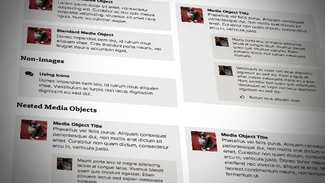
Media Objects:
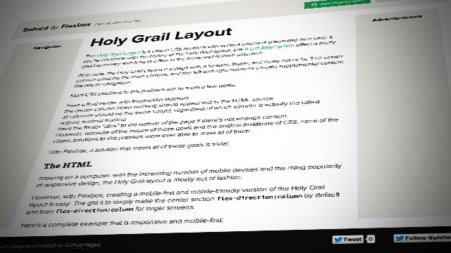
Holy Grail Layout:
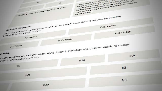
CSS Grids #
Grids allow to place the content anywhere in the defined grid. If you’re familiar with Grids like those Bootstrap, Foundation, 960.gs or Suzy the idea is the same but the syntax is now fully native.
Unlike the alternatives mentioned above native CSS grids use the browser’s CSS parser and don’t rely on floats and percentages. We save the extra weight of the framework and we can create any type and shape of layouts as we need to meet our design goals.
With a grid (whatever kind) we can get a close approximation to what a 12 or 16 column layouts that we see in print and we can lay out the content in as many ways as you can think
The example below, taken from Grid by example, shows how to build a “holy grail layout” using CSS Grids and Media Queries to change the layout as needed for different displays and resolutions.
You can also use Flexbox and Grids together. You can create a masthead using Flexbox and place it inside a grid like you normally would :-)
Columns #
CSS Multi-column Layout Module provides multicolumn layouts for the web without hacking the content to display how we want it to.
The columns module still cannot do threaded frames (think of InDesign) but that may yet become part of the web as part of a different specification.
Support for widow and orphans is mostly complete with Firefox being the last remaining houldout in supporting the feature (and the bug laying dormant since 2010 doesn’t inspire much confidence in them being implemented either.)

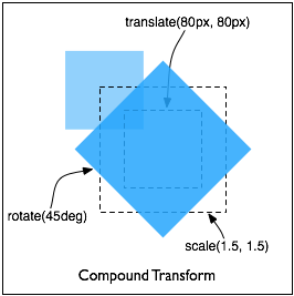
Rotation, skews and translations #
Most people do rotations, skews and translations in the context of CSS 2D animations but we can also use them as static elements that will appear in its final form when displayed on the document.
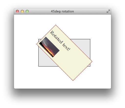
We can also chain transformations to achieve more sophisticated effects.
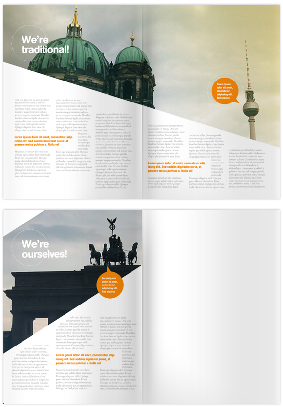
Shape outside #
I’ve always loved how text wraps around an image shape, be it a circle or some sort of polygon where the text wraps close to the shape of the image regardless of its shape. When the CSS Shapes Module Level 1 specification was released and even more so when it went to Candidate recommendation I was ecstatic.
Now we can do layouts like these witout hacks.
Until the level 2 specification is implemented in browsers we’ll just have to be happy with shape-outside, its limitations and workarounds.
Shapes level 2 will gives full implementations of shape-inside.

Shape inside allows to put text inside a shape without having to resort to javascript or hacks using 2 shape outside objects to get a similar effect.
The level 2 specification also gives us padding and margins for our shapes :-)
