Web Components as Pattern Libraries: Building the element
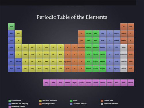
One of the things that have caught my attention about web components is how easy it is to adapt them as pattern libraries and design libraries. Because we can isolate the style and scripts for each individual component and compose larger UI elements from smaller elements, Web Components are ideal for this type of work. Before we can delve into pattern and design libraries we need to design what they are. So here we go: > A design library completely covers an element or a pattern: what it intended purpose is, how it looks, what behaviors and styles are available for the element and how we use it. The idea is that wherever we use an element from the library we know what it'll look like and how it will behave. This allows designer to create consistent interfaces for their applications. Web Components make it easier to create reusable elements. we can create elements where the content is assigned to different areas of the template and, unlike template engines like Moustache and Handlebars, this is all baked into the platform. Add ShadowDOM for encapsulation and custom styles built with css variables and you have a full suite of tools to create your patterns and libraries. For the examples in this essay I will use [Polymer 1.x](https://www.polymer-project.org/1.0/). It may not be an ideal platform for all pattern libraries but I think it illustrates some of the concepts I'm trying to make. We can also take advantage of some advanced CSS features to make sure we don't have to style ## Atomic web design I will use a modified version of Atomic Web Design as the underlying principle and rules to build the pattern library. [Josh Duck’s Periodic Table of HTML Elements](http://zqsmm.qiniucdn.com/data/20110511083224/index.html) does a good job illustrating that all our web content, regardless of for factor or what framework generated it, uses the same elements.  Because all the content that we use for the web starts from the same basic components we can use a similar building pattern to what nature uses, going from the simplest to the most complex. > Atomic design is a methodology composed of five distinct stages working together to create interface design systems in a more deliberate and hierarchical manner. The five stages of atomic design are: 1. Atoms 2. Molecules 3. Organisms 4. Templates 5. Pages The main difference in my web component based approach is that I'll concentrate on Molecules and higher organisms. Atoms (all [HTML Elements](https://developer.mozilla.org/en-US/docs/Web/HTML/Element)) atoms are part of each molecule and can be changed by changing the component. We'll look at how to customize a component later in the article but one of the great advantages of web components is that you can create one customizable molecule to handle many layouts and color arrangements without having to create customized versions of the element. ## Building a molecule using Polymer Before we can build a custom molecule we have to build a Polymer element. This requires [Bower](https://bower.io/) in order to install the dependencies for our element. Install Bower as a global Node application if you haven't done so already. ```bash npm install -g bower ``` Once Bower is installed run the initialization command and answer the questions when prompted. ```bash bower init ``` For a normal Polymer Application I'd suggest installing the [Polymer CLI](https://www.polymer-project.org/1.0/docs/tools/polymer-cli). This will make it easier to work with Polymer and the Paper and Iron element collections. Because I don't want to tie the pattern library to a style (Material Design) or a given philosophy of how to build molecules we'll go with the manual way instead. At the root of the application, run bower to install the Polymer library. ```bash bower install --save Polymer/Polymer ``` Then create a directory for your component and change to the directory. ```bash mkdir pattern-figure cd pattern-figure ``` ## creating a pattern I will use the `pattern-figure` element throughout ```markup
