
Variable viewport units
We're used to a set of viewport units that represent the size of the browser's viewport.
vw: 1% of the width of the viewport sizevh: 1% of the height of the viewport sizevmin: the smaller ofvworvhvmax: the larger ofvworvh
The existing viewport units deal with physical properties.
In this post we will look at the new variable units, how they would work and why they are necessary when working in mobile.
New viewport units for mobile #
Give an element a width of 100vw and a height of 100vh, and it will cover the viewport entirely. This is normally the desired effect on desktop but may not be what we want in mobile devices.
In mobile devices, the presence or absence of dynamic toolbars, like address and tab bars, affect the viewport size.
Although the viewport size can change, vw and vh do not. Elements sized to be 100vh tall will bleed out of the viewport in mobile devices. In this state, elements sized to be 100vh tall will cover the entire viewport and move under the User Agent (UA) UI, rendering that portion of the content invisible.
The CSS working group has codified three new groups of viewports units:
- Large
- Small
- Dynamic
These new viewport units address issues with the existing viewport units and the presence or absence of browser UI elements.
When we talk about UA or browser interfaces, we're talking about things like address bars and tab bars that can be hidden based on user scrolling in mobile devices.
Large viewport units #
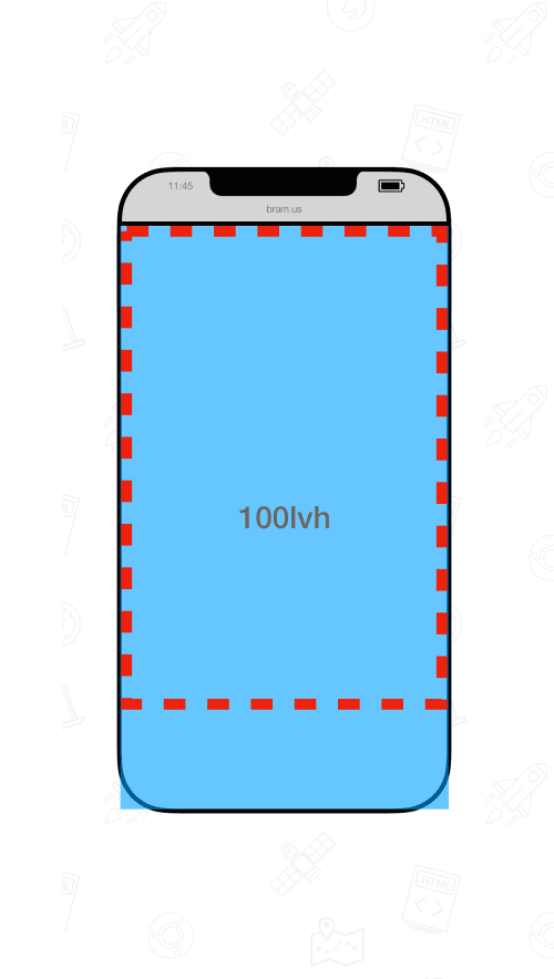
The large viewport sizes assumes that any UA interfaces that are dynamically retracted are retracted.
Units representing the large viewport have the lv prefix. The units are:
- lvw
- lvh
- lvi
- lvb
- lvmin
- lvmax
Small viewport units #
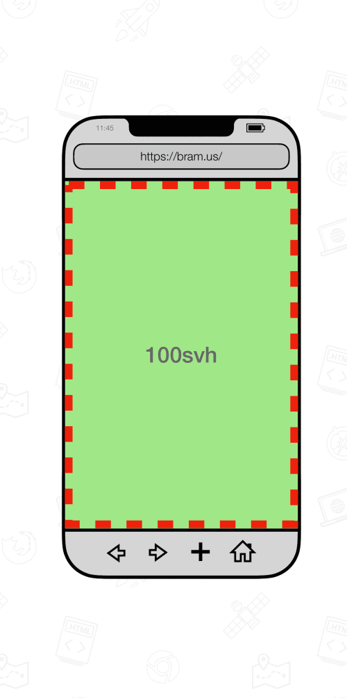
The small viewport units assume that any UA interfaces are expanded.
Units representing the small viewport have the sv prefix. The units are:
- svw (width)
- svh (height)
- svi (inline dimension)
- svb (block dimension)
- svmin (smaller of svw and svh)
- svmax (larger of svw and svh)
Dynamic viewport units #
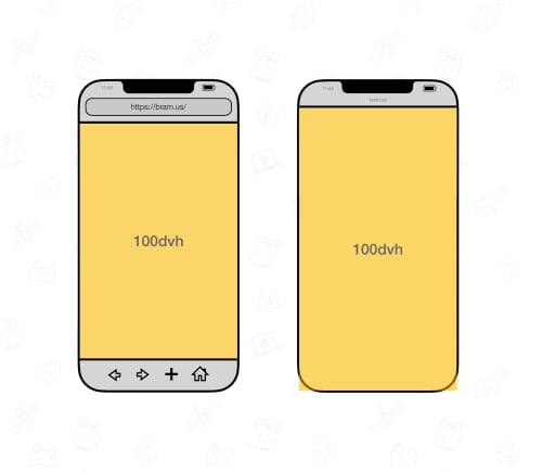
The dynamic viewport will automatically adjust itself in response to UA interface elements being shown or not. The changes to dynamic viewport units will not show automatically. Browsers have a different strategy to update the dynamic viewport values.
The dynamic viewport units are:
- dvw
- dvh
- dvi
- dvb
- dvmin
- dvmax
So when would you use wich? #
One of the things that always trips me when I see properties that are similar like these, is which one to use. This is tricky as it means we have to decide up front what set of properties to use and how we expect them to interact with different mobile devices.
The idea is that we'd use the large viewport units when we want to work with the full size of the viewport and assume that all browser UI elements are hidden. This would give us more space to work with.
If the max-height attribute is 100svh then we set the .jumbotron element to be 10% of the height of the smaller browser viewport.
If the max-height attribute will match 100lvh then we set the .jumbotron element to be 20% of the height of the device without their UI elements.
@media (max-height: 100svh){
  .jumbotron {
    height: 10svh;
  }
}

@media (max-height: 100lvh) {
  .jumbotron {
    height: 20lvh;
  }
}
There is also a dynamic viewport set of units that will adjust themselves based on the presence or absence of the browser UI elements.
A better explanation, taken from web.dev's The large, small, and dynamic viewport units site:
- If the dynamic toolbars are expanded, the dynamic viewport is equal to the size of the small viewport
- If the dynamic toolbars are retracted, the dynamic viewport is equal to the size of the large viewport.
A Note on Logical Viewport Units #
In logical viewpoer units the meaning of block and inline will change based on the writing mode of the text.
For the default viewports, the new units are:
vi = 1% of the size of the viewport’s inline axis. In Latin (left to right and top to bottom) languages this is equivalent to vw
.horizontal {
  writing-mode: horizontal-tb;
  width: 10vi; /* Same as 10vw */
}

.vertical {
  writing-mode: vertical-lr;
  height: 10vi; /* Same as 10vh */
}
vb = 1% of the size of the viewport’s block axis. In Latin languages this is equivalent to vh
.horizontal {
  writing-mode: horizontal-tb;
  width: 10vb; /* Same as 10vh */
}

.vertical {
  writing-mode: vertical-lr;
  height: 10vb; /* Same as 10vw */
}
The logical viewport units for large, small and dynamic viewports are:
lviandlvbsviandsvbdvianddvb
Things to consider #
This is not without issues and things to keep in mind.
In browsers that don’t have dynamic UA UI — such as desktop browsers — the size of the large, small, and dynamic viewports are the same.
If you set an element to 100lvh and the browser UI elements are shown, the content will be larger than the viewport and parts of it may be hidden.
None of the viewport units take the size of scrollbars into account. On systems that have classic scrollbars enabled, an element sized to 100vw will therefore be a little bit too wide. This is as per specification.
The values for the dynamic viewport do not update at 60fps. In all browsers updating is throttled as the UA UI expands or retracts. Some browsers even debounce updating entirely depending on the gesture (a slow scroll versus a swipe) used.
The on-screen keyboard (also known as the virtual keyboard) is not considered part of the browser UI. Therefore it does not affect the size of the viewport units. In Chrome you can opt-in to a behavior where the presence of the virtual keyboard does affect the viewport units.
Links and resources #
- The large, small, and dynamic viewport units — web.dev
- The Large, Small, and Dynamic Viewports
- https://blog.webdevsimplified.com/2022-08/css-viewport-units/
- CSS *vh (dvh, lvh, svh) and *vw units
- Variable Units — CSS Variables Level 2 specification
- Viewport-percentage Lengths (aka “Viewport-relative Units”) explainer — Interop 2022