
Understanding the CSS box model
One of the things I've always had a problem understanding is the CSS box model. I'm writing this, based on content from MDN to try and understand it better.
When laying out a document, the browser treats each element as a rectangular box according to the standard CSS basic box model. CSS determines the size, position, and properties of these boxes.
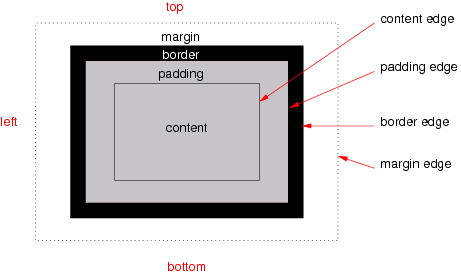
Every box is composed of four areas: content, padding, border, and margin.
Different box models in CSS
The content area contains the "real" content of the element, such as text, an image, or a video player.
Its dimensions are the width and height of content-box. It often has a background color or background image.
The padding area extends the content area to include the element's padding. Its dimensions are the padding-box width and height.
The thickness of the padding is determined by the padding-top, padding-right, padding-bottom, padding-left, and shorthand padding properties.
The border area extends the padding area to include the element's borders. Its dimensions are the border-box width and the border-box height.
The thickness of the borders is determined by the border-width and shorthand border properties.
If the box-sizing property is set to border-box, the border area's size can be explicitly defined with the width, min-width, max-width, height, min-height, and max-height properties.
The margin area, bounded by the margin edge, extends the border area to include an empty area used to separate the element from its neighbors. Its dimensions are the margin-box width and the margin-box height.
The size of the margin area is determined by the margin-top, margin-right, margin-bottom, margin-left, and shorthand margin properties. When margin collapsing occurs, the margin area is not clearly defined since margins are shared between boxes.
So the idea is that, by default, when we have the following CSS declaration:
.my-box {
  width: 1200px;
  height: 900px;
  margin-top: 10px;
  margin-left: 20px;
  margin-bottom: 20px;
  margin-right: 200px;
}
The dimensions of the box containing the .my-box element are:
height: 930px (900px content height + 10px margin-top + 20px margin-bottom)
Box sizing #
If the element has any border or padding, this is then added to the width and height to get the final size of the box that's rendered on the screen. When you set width and height, you have to adjust the value you give to allow for any border or padding that may be added.
The box-sizing property can be used to adjust this behavior:
content-box gives you the default CSS box-sizing behavior.
If you set an element's width to 100 pixels, then the element's content box will be 100 pixels wide, and the width of any border or padding will be added to the final rendered width.
.my-box {
  box-sizing: content-box;
  width: 800px;
  height: 800px;
  border: 10px solid #5B6DCD;
  padding: 5px;
}
border-box tells the browser to account for any border and padding in the values you specify for an element's width and height.
If you set an element's width to 100 pixels, that 100 pixels will include any border or padding you added, and the content box will shrink to absorb that extra width. This typically makes it much easier to size elements.
When there is a background-color or background-image set on a box, it extends to the outer edge of the border (i.e. extends underneath the border in z-ordering). This default behavior can be altered with the background-clip css property.
.my-box {
  box-sizing: border-box;
  width: 800px;
  border: 10px solid #5B6DCD;
  padding: 5px;
}
Make sure that if you're using box-sizing in an element that will be reused in multiple places that the same value for the property is used everywhere in the app.