
Serving two masters and serving neither master well
This is a response to a page that raised enough concenrts for me to want to write about it but not important enough to put into my regular post rotation
The page that started the research and this piece is: Frequently Raised Concerns. Like they did I will monologue and do my best to provide additional alternatives and try not to come too hard on the criticism.
TL;DR #
Supporting a single rendering engine and OS is dangerous, particularly when such rendering engine lags behind in standards support and in communication towards developers, other browser makers and standards bodies, may not be the best solution. The fact that it has a predominant market share in mobile devices in the US doesn't mean that's the case everywhere or those predominant devices are as powerful everywhere.
Assuming that people will only read your books in the platform/browser combination that you support is disingenuous and likely to turn people away from your offering.
Readers preferences drive people to paper books, regardless of their profession or whether they evangelize the open web platform. Calling their efforts "yapping" makes people less inclined to take the argument of the person making it seriously.
If you can't be bothered to provide a way to increase the font size of a "book" on your application then why should people bother reading books in your platform at all?
The web was never designed as a paginated medium. In its origins, the shared documents were as long as they needed to be. You'd have to ask your readers if they are bothered by the scrolling. Likewise, pigeonholing the web and the technologies it uses due to a vision that book-like content will make people read online is misguided at best.
We've also built different expectations for web content... We have different ways to paginate that don't require content to be laid out as a book with page swipe animations every time we move around the content.
What are we making: a web app for reading or a reading app? #
It's tempting to try and duplicate the feel of an application when working on the same functionality as one. When we do we lose the flexibility of the web as a medium? When working online, more so than when we work in apps, we have an infinite canvas that we can use to creatively frame our content.
Most ebook readers are tied to the device's rendering engine... Webkit in the case of iOS (browsers other than Safari don't get the same features Safari does, just a web view), whatever specific rendering engine powers the webview for your Android app and whatever rendering engine powers the web browser you're using (EdgeHTML for current versions of Edge, Gecko for Firefox, and Blink for Chrome, Opera, Brave, and, soon, Edge).
And the number of options is what makes the question of iPad first an interesting one... if we're going to support Webkit in iOS as your primary platform (which is what saying you're iPad first) means for other devices and renderers, particularly when other rendering engines support a wider palette of APIs and tools?
Most of our content doesn't care what form factor we are in and what's the size of the screen but all e-readers have a way for users to control the size of the text on the screen. The challenge comes when working with richer multimedia content. Then we need to make sure that related items work together as designed. Something web developers have been doing for decades.
What affordances are we offering? Which ones matter #
Before we talk about affordances let's define some terms so we start from a common base.
The word "affordance" was originally invented by the perceptual psychologist J. J. Gibson (1977, 1979) to refer to the actionable properties between the world and an actor (a person or animal). To Gibson, affordances are a relationship. They are a part of nature: they do not have to be visible, known, or desirable.
From Affordances and Design — Don Norman
When planning a new interface or product some of the questions I ask are:
- What affordances are we offering our users?
- Do the affordances match user expectations (and if they don't why not)
- How can we leverage the web as a platform to improve the reading experience?
The first affordance that I look for is navigation... How do we move between pages of content and how do we navigate our content.
But apps and the web are different. From any point in a document we can navigate in any direction or we can keep the navigation metaphor we bring along from physical books. Craig Mod asks the question about the iPad but I consider it equally valid for desktop and other mobile browsers:
Do we embrace the physicality of the device — a spineless page with a central axis of symmetry? Or do we embrace the device’s virtual physicality — an invisible spine defined by every edge of the device, signaling the potential of additional content just a swipe (or click or key press) away?
Craig Mod A Simpler Page
Most e-reader applications work on their own implementations of a given metaphor and you have to learn the way the different affordances work for the different combinations of devices and platforms.
The web reduces the number of affordances we need to provide by streamlining the ways we can provide them for both desktop and mobile devices.
APIs like Pointer Events allows both desktop and mobile devices to respond to native inputs using a single set of instructions…. It also helps smooth out inconsistencies between touch, mouse and other types of pointer devices as well
Because Safari, both desktop and mobile, consistently lags behind support for APIs, like Pointer events, so we may have to use polyfills like Points or Deeptissue to make sure the pointer will work regardless of what device we're using. Read Apple's criticism from Chris Love, Tim Kadlec, PPK and Jeremy Keith
Another affordance that is important is controlling the size of the font in our web readers. Regardless of what we read and where we read it we've always had the option of controlling the size of the text on screen to suit our needs either using the device's native controls or with application-specific affordances that are easy to use and have clear clues about how to get to them and how to use them.
Even if we use the physical book as a metaphor. I read differently depending on how and where I'm reading. The iPad equivalents:
- Close to face: Reading a novel on your stomach, lying in bed holding the iPad close to me or with the device laying down as I read. Decreasing the size of the font on a desktop or laptop to get a little more content per page
- Medium distance from the face: Sitting on the couch or perhaps on the train on my way to work with the device at arm's length or the device on my lap
- Far from the face: The iPad propped up by the keyboard at an angle or the device sitting on my desk a little farther than it would when reading on the train
This is one aspect of how to address font sizing for web reading experiences. It does not address other typographical elements such as font selection (even when using the same measure condensed and expanded fonts will not look the same) line-height, kerning and others that are just as important. It also skips accessibility altogether which is also an important issue.
A related issue, for me, is what affordances are we providing developers when creating content using your tools. It may be the most wonderful tool but if I'm not comfortable using it I may not be using it for long.
The next question is whether the affordances we provide are meeting users needs and expectations.
If the users keep asking about aspects of your app then there's something wrong with the app and not with the way your users look at it.
Pagination nightmares: Redefining how we navigate on the web #
Providing a page animation to indicate page turning it's not skeuomorphism when done right. But even when done right page turning animations become tiresome, particularly when we talk about long documents with hundreds of pages or when we try to navigate to specific portions of the content, especially towards the end of a book.
CSS Scroll Snap allows you to create your own pagination styles for the application we're creating and also define the dimensions of the items you're scrolling, in effect creating basic pagination.
Another possibility would be to use pagination
As with Pointer Events, lack of uniform support means that we need a CSS Scroll Snap polyfill for the time being.
The danger of uninformed criticism #
From the Bubblin site:
Here's a website (they call it a book) on Essentials of Image Optimizations by Addy Osmani.
Excellent write-up but it takes about ~90 (+/- 5) scroll actions using a mousewheel to reach the bottom of the essay while also maintaining the reading direction i.e. making sure I "saw" all of the content (am emulating experience of committing to and reading the book for real here) sequentially. The same website takes close to ~194 swipes to scroll down to the bottom on an iPhone X Safari and ~244 swipes on the Android Galaxy Express 3 while also ensuring that all of the content was seen by me. I don't know about others, but I'd never scroll deeper than seven times for even the best blogpost of this decade on my mobile. A maximum of ten swipes if it's really interesting content or an important one.
The criticism of Ady Osmani's Essential Image Optimization book is poorly thought out and disrespectful. The book is laid out as a single page application but the critique makes the assumption that scrolling is the only way in which we navigate content. When I read the book I navigate to the table of contents swiping down twice or using keyboard navigation (built into the browser experience when HTML is coded properly) where I begin my exploration of the book which requires less scrolling. To return to the top I can either tap the top of the browser window or use command/control + up arrow to return me to the top of the document. So how is this inaccessible?
This is similar to the process of navigating a page using screen readers: you have the option of having the entire page read to you or navigating via landmarks.
But even if I had to navigate swiping down or using arrow keys or space bar or page up/down why would scrolling be a problem? The site provides a summary above the fold and the table of content below it so people will get the table of content only after they've decided they want to move forward with the site and find what they are looking for. We don't always read technical books from beginning to end every time. These are not blog posts any more than the Bubblin "super books" are and they shouldn't be treated as such just to make an argument.
Biggest question is why does he consider the book to be a blog post and talks so condescendingly about the content he didn't author and that doesn't use their technology? Would the authoring platform make a difference in the author's evaluation?
Does it need pagination? I don't think it does but perhaps it would have benefitted from being a multi-page application rather than a single page one or having links that would return you to the table of contents.
Where I have a strong issue is on the position the Bubblin author takes about people, who happen to work in technology, choosing to read a technical book as a paper book rather than using an online version. User preferences seem to not matter as much as the perceived shortcomings of the competing technology.
Readers of Sarah Drasner's book on SVG Animations, however, we might be compelled to think, will prefer an e-book? Her fans are developers and tech evangelists who yap about digital coolness all day— about open web!— and it is clear that technology advances faster than a physical book could be doled out, so her book doesn't even make sense in atomic form, but does PDF or DOC file with faux pagination or an ePub file or an HTML page with reflowable content fulfill the perception of books held by the developer community?
I would say the answer is neither. I choose paperback technical books because they are easier to scan and the indexes are easier to navigate than a list of hyperlinks.
So now we "yap" about the open web? Does it mean we should dogfood your product to prove that the web is a good reading medium?
What most people are saying, and something the author of the article chooses to ignore is the fact that our relationship with printed books is much more than just a reading device. As Craig Mod points out in Future Reading:
Once bought by a reader, a book moves through a routine. It is read and underlined, dog-eared and scuffed and, most importantly, reread. To read a book once is to know it in passing. To read it over and over is to become confidants. The relationship between a reader and a book is measured not in hours or minutes but, ideally, in months and years.
Does the technology match the comfort level of a printed book? No, it doesn't, at least not for me. Does the Bubblin technology change that? Most definitely not when I'm stuck on one font size throughout the whole reading experience and I get none of the affordances I get from a paper book (annotations, bookmarking and others). Even if I was able to change the size of the text from the application UI (which I'm not) it's still a poor user experience when the size of the UI itself changes but not the size of the content inside, which is what I really wanted to change
And, before I'm reminded that this is an iPad first experience, this has far less to do with the device and platform we're using to read digitally and more to do with the reader's comfort and familiarity with the platform, whether online or offline.
Attention Economy #
Bubblin presents a Chartbeat chart without any context to try and prove a point.
I've linked the chart as is from the Bubblin essay to give you an idea of what I mean:
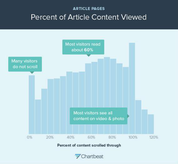
The chart on its own is missing something. There is no summary of the data or context for the results. What type of site is the data referring to? Are users accessing it in mobile or desktop devices? What countries are they accessing the content from?
There is a lot of context missing from the chart and I have to wonder if the full context of the chart would support the conclusion being drawn about it.
Likewise, when he uses Google's search result page pagination as a model of what are the shortcomings of pagination on the web he forgets the primary difference between computer-generated pagination for the results of a search engine query with the pagination used for a book or other paginated long-form content.
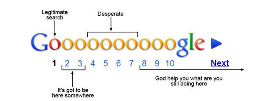
The search results are grouped in order of relevance where the results grow less relevant with each page you navigate to. How does this relate to paginated long-form content?
If the online content is properly laid out we have multiple ways of navigating it. We can do so sequentially or we can jump into a bookmark or we can jump to the page holding the content we just left (assuming we remember which one it is). But it's not based on content relevance so the same rules that apply to Google's search results don't apply to content we create. If you author long-form content I'm guessing that all the content is equally relevant.
Why people prefer to read in print? #
How do you extrapolate the small research studies Bubblin presents in their essay to a larger population?
In The Reading Brain in the Digital Age: The Science of Paper versus Screens, a much larger meta-study, the report indicates that:
Analyses revealed three significant moderators: (1) time frame: the paper-based reading advantage increased in time-constrained reading compared to self-paced reading; (2) text genre: the paper-based reading advantage was consistent across studies using informational texts, or a mix of informational and narrative texts, but not on those using only narrative texts; (3) publication year: the advantage of paper-based reading increased over the years.
So while researching further implications of the difference between reading online and reading physical books I came across this interview with Anne Mangen, chair of a research project about reading in an age of digital transformation.
How much time do we spend reading on screen and what are we reading?
The answer to this depends on how "reading" is defined. The research and statistics in this area vary depending on how the term is defined. Are we referring solely to the reading of textual material, or are we also including pictures, social media and hypertext containing links? If the latter definition is used, we can say that we are reading as never before and that the Internet has brought about an explosion of reading.[...]
The interviewer asks a followup question which, I think, is essential to this discussion:
When do we prefer a printed medium, such as a book?
There are many components, factors, and conditions that can come into play here, such as the reader, the material, the purpose, and the technology. Not only the reader's proficiency, background, and expectations must be kept in mind, but also the type of material that is being referred to and the kind of screen that is being used. It is not a case of "one size fits all," but patterns are beginning to emerge from empirical research into the subject. The length of the text seems to be the most critical factor. If the text is long, needs to be read carefully and perhaps involves making notes, then studies show that many people, including young people such as students, still often prefer a printed book, even if it is available as both an e-book and in electronic formats with options for making notes, enabling the user to search for and highlight the text digitally. This is not the case when it comes to shorter texts.
So is it really the technology that makes reading online less useful than reading a physical book or is it the user's preferences themselves that make one more appealing over the other?
What I see as web reading experiences: Taking advantages of the online medium? #
When I made a comment about needing to keep the browser's built-in affordances I was thinking about font sizing and alternatives way to navigate their content. I was first thinking about Desktop browsers but then realized that these affordances are equally important for other form factors.
Epub books were designed with apps in mind as closed ecosystems where vendors have the last word into what makes it and what doesn't make it into a product. It wasn't until recently when frameworks like Readium and, I guess, Bubblin's product, became open web toolkits that we could unpack an ebook and make the content on the web.
The web platform is as flexible and powerful as you need it to be; if it doesn't provide some capabilities natively then you can create it or use a third party solution.
How can I annotate my content? Tools like Annotator allow you to annotate and share your content without having to "loan" your book.
Can I bookmark items inside the book? Annotations can serve the same purpose as bookmarks or, if you're brave, you can code your own solution that bookmarks specific sections of your content.
Are we taking any built-in affordances away from our users? For each affordance that we take away, we should provide a polyfill or replacement for it.
I have seen good reading experiences on the web. They all move away from a straight book metaphor and move towards a more engaging multimedia user experience.
FF Meta Variable Font Demo by Jason Pamental was designed as a demonstration of variable fonts and how they work in CSS today. But I love the way that he plays with columns and the different text sizing and layout.
Scaling Everest (Washington Post) and Snow Fall (New York Times) present two different ways to present long-form content combining varying amounts of text, images, and video.
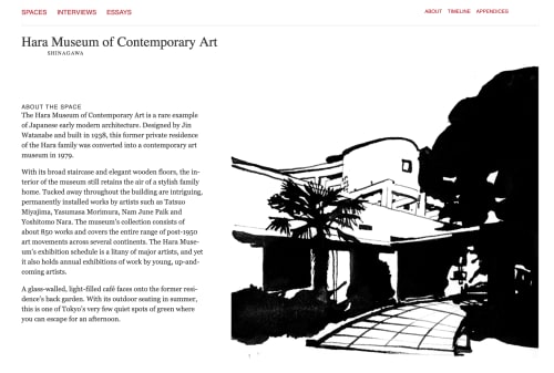
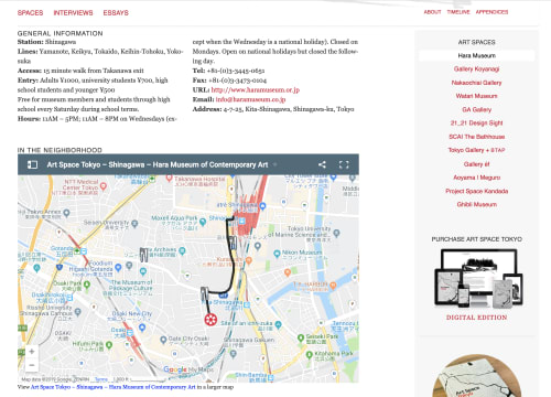
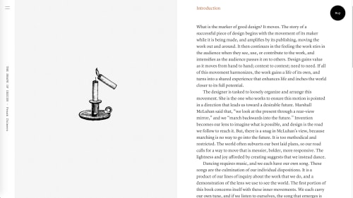
Art Space Tokyo and The Shape of Design present the content of printed books in a way more conducive to reading online.
Art Space Tokyo is not meant to be a replacement for the physical books but provides the same reference material in a way that is easier to engage with online. There is no physical equivalent to the Google Map, you'd have to list all the information for the locations which would make it longer and more tedious to read.
The Shape of Design, on the other hand, seeks to reproduce the text and the images of the book into an online environment. Each chapter in the physical book.
Whichever way you choose to read it's beyond the book metaphor.
Bibliography and References #
- Infinite Scrolling Is Not for Every Website
- How Users Read on the Web
- Designing for iPad: Reality Check
- What the iPad Is Missing (No, It’s Not a Camera)
- Books, Typography and the iPad
- The iPad in the eyes of the digerati
- As Transparent As Typography
- The Elements of Typographic Style Applied to the Web
- Research Reporrts
- Craig Mod
- Frank Chimero
- Affordances
- Nieman Lab
- Hick's Law
- Examples