
Responsive Images Deep Dive
Responsive images seek to answer the following question: How can we incorporate images in responsive layouts that are appropriate for a device and its resolution without loading unnecessarily large images for mobile devices? It is not always intuitive and it has taken me years to get my head wrapped around the responsive images concepts and how to build the images.
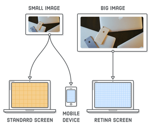
The idea is that we have images sized for each type of device and we let the browser decide which one is most appropriate for the device, resolution and screen size combination like the image below shows.
Different versions of the same image depending on device and resolution. The problem responsive images try to solve. From Internetting is hard
We'll discuss a few of the use cases for responsive images and ways to automate the generation of all images (because if we have to do it manually then we're less likely to do it... :))
This is not a detailed guide to Responsive Images. If that's what you're looking for I'll refer you to Jason Grigsby Responsive Images 101 series.
This post doesn't cover using CSS and background images in responsive layouts. That's a whole different post that requires different tools and different mindset for getting it to work.
Handling high DPI images #
The first item that caught my attention is how to deal with high density (also known as Retina images) when adding images to your content.
The issue with high-density images is that higher densities require more pixels to render the image to the quality we want; more pixels make the images larger and larger files take longer to download particularly in slower mobile devices (that will not need the larger files).
We'll discuss how to create retina images and how to compress images for delivery at the end of the post. For now, we'll concentrate on how to do it.
<figure>
<img src='illustration-small.png'
  height="240" width="320"
  srcset='images/illustration-small.png 1x,
          images/illustration-big.png 2x,
          images/illustration-extra-large.png 3x'>
</figure>
The idea is that we create two images one at normal density and other encoded at double the density and let the browser decide which one to use based on the display density of the computer we're using.
In this case, we provide options for standard definition, 2x for Retina images and 3x for very high definition images.
Different device widths #
We handled different display densities. Now we need to handle different display sizes (not density) and how to provide images that are sharp enough but don't send a ton of unnecessary bytes down the wire to devices that won't use them.
The responsive image becomes more complex. In addition to the src attribute, we now have srcset and sizes.
<figure>
<img alt="Sunset in Santiago"
  srcset="santiago-sunset-800.jpg 800w,
          santiago-sunset-1200.jpg 1200w,
          santiago-sunset-500.jpg 500w,
          santiago-sunset-1000.jpg 1000w"
  sizes=" (min-width: 1066px) 800px,
          (min-width: 800px) calc(75vw - 137px),
          (min-width: 530px) calc(100vw - 96px),
          100vw"
  src="santiago-sunset-800.jpg">
</figure>
The srcset attribute associates an image file with a given measurement. This measurement is the actual width of the source file and it has nothing to do with browser sizing or viewport dimensions.
Shortly after the browser downloads the HTML, it requests CSS and JavaScript but, before the CSS and JavaScript are done loading, the browser starts downloading images.
Since CSS and JavaScript have not finished downloading, the browser downloads images without knowing what the layout of the page will be. And without knowing the layout, it doesn’t know what size the image element will be.
The only thing that the browser does know is the size of the viewport. Once we move past display density descriptors, everything hinges on the size of the viewport.
The size attribute helps us with image sizing. It tells the browser what size the image will be in relation to the size of the viewport. We also tell the browser how that relationship changes as the size of the viewport changes.
The attribute is made of two parts: a media condition, a limited type of media query that represents the viewport width and a length value (either explicit, like 800px) or a calc to create values based in the viewport) to tell the browser the actual dimensions of the image when the media query matches.
When the browser sees the sizes attribute it'll take the first one where the media query matches or the default value if none of the other media conditions match.
With this we've taken care of matching images to viewport sizes. Next we'll look at using images to art direct the look of a site.
Art Directing #
Art directing, in this context, means to control the images based on the viewport dimensions. This is similar to how we control images based on viewport width but it introduced new elements and new attributes for existing elements.
The primary way to art direct responsive images is to use the picture and source elements. Picture has good browser support and the source element is support (with different attributes) in video and audio elements.
The picture element can have one or more source children. We can tailor these to the form factors that we need to support.
Each source element can have one or more of the following attributes:
- src — Address of the resource
- type — Type of embedded resource
- srcset — Images to use in different situations (e.g. high-resolution displays, small monitors, etc)
- sizes — Image sizes for different page layouts
- media — Applicable media
So we can build the pixel densities and viewport widths use cases inside the individual source elements.
<picture>
  <source media='(max-width: 400px)'
          srcset='images/photo-small.jpg'/>
  <source media='(min-width: 401px)'
          srcset='images/photo-big.jpg'/>
  <img src='images/photo-small.jpg'/>
</picture>
This is the simplest example possible. When the device viewport is smaller than 400px then use the photo-small image and when it's larger than 401px then user photo-large. When neither device matches then use the default img element and its src attribute.
Getting clever: Using WebP where supported #
One of the things we can do with source elements is to add different image types and let the browser pick ones that it supports. The combination of type and media attributes gives us a big level of flexibility.
<picture>
  <source type='image/webp'
          srcset='images/photo-big.webp'>
  <source type='image/webp'
          srcset='images/photo-small.webp'/>
  <source srcset='images/photo-big.jpg'/>
  <source srcset='images/photo-tall.jpg'/>
  <img src='images/photo-small.jpg'/>
</picture>
I've taken the example from the previous section and modified it to use type instead of media. Because we can use viewport widths srcset and sizes inside each source attribute we get all the flexibility of choosing the type of image we want to work with and the benefits of having multiple images to choose depending on the
Generating the (responsive) images to use #
So far we've only discussed how to put responsive images in our pages but we haven't talked about the 500-pound gorilla in the room... the number of additional images we need to create to make responsive images happen.
We'll discuss two ways of generating the images that we want along with requirements and additional considerations.
Bash scripts and Image Magick #
There are projects where I don't want to install Gulp and its toolchain to accomplish tasks. In that case, I'd rather rely on my package manager and shell scripting to accomplish the goal.
To get this script running we need to make sure we have installed Imagemagick and Graphicsmagick in our system before proceeding.
On a Mac, I use Homebrew to install the packages with the following command:
brew install imagemagick graphicsmagickIn Ubuntu Linux and Windows running Windows Subsystem for Linux and the Ubuntu image I use the following command to install the packages
sudo apt-get install imagemagick graphicsmagickOnce the packages are installed I use the following script to generate the images
#!/bin/env bash

INPUT=images/master/*.jpg
OUTPUT=images/
Q=75

mkdir -p $OUTPUT/{100,300,800}

for f in $INPUT
do
  echo "Processing: $f"
  fn_ext=$(basename "$f")
  fn="${fn_ext%.*}"
  convert $f -resize 100x100 -interlace Plane \
        -quality $Q $OUTPUT/100/$fn.jpg
  convert $f -resize 100x100 \
        -define webp:lossless=false \
        -quality $Q $OUTPUT/100/$fn.webp
  convert $f -resize 300x300 -interlace Plane \
        -quality $Q $OUTPUT/300/$fn.jpg
  convert $f -resize 300x300 \
        -define webp:lossless=false \
        -quality $Q $OUTPUT/300/$fn.webp
  convert $f -resize 800x800 -interlace Plane \
        -quality $Q $OUTPUT/800/$fn.jpg
  convert $f -resize 800x800 \
        -define webp:lossless=false \
        -quality $Q $OUTPUT/800/$fn.webp
  done
The script looks for images in images/master and for each image that it finds there it performs the following tasks:
- It resizes the image to a square of the corresponding size and generates a jpg image
- It uses a quality of 75
- It interlaces the images to create progressive JPGs
- It resizes the image to a square of the corresponding size and generates a Webp image
- The script makes WebP use lossy compression to make the images as small as possible (
-define webp:lossless=false)
- The script makes WebP use lossy compression to make the images as small as possible (
The script stores the images in subdirectories of images/ named after the size we created them with (100, and so on).
The script has a few areas where it can be improved:
- It matches only JPEG files, not PNG or TIFF
- It makes squares of the images, regardless of the original size. This may not be desirable when we work with responsive images for art direction
How to change this is left as an exercise for the reader :)
Gulp and gulp-responsive #
The shell script is simple and limited. If you already use Gulp as part of your site's build process you can include building your progressive images into this build process. I've chosen to use Gulp and gulp-responsive.
gulp-responsive depends on sharp. Sharp is one of the fastest Node.js modules for resizing JPEG, PNG, WebP and TIFF images.
If you are using Mac OS then before installing gulp-responsive you should install the libvips library. Further information and instructions can be found in the sharp installation guide.
Once libvips is installed we can install initialize package.json if you haven't initialized already.
npm init --yesThen we can install the packages. I am pinning the version of Gulp at 3.9.1 rather than the current 4.0 version to make sure that it works properly rather than try and figure out why the task is not working in the latest version.
If you haven't done so already, install gulp-cli globally:
npm install --global gulp-cliThen install the packages for your project:
npm install --save-dev gulp@3.9.1
npm install --save-dev gulp-load-plugins
npm install --save-dev gulp-responsive
The task itself, created as the default task in the example below takes a set of master images and creates three different JPG versions of the image and a single WebP version of the image at the largest size.
const gulp = require('gulp');
const $ = require('gulp-load-plugins')();

gulp.task('default', function() {
  return gulp.src('images/master/*.{jpg,png,tiff}')
      .pipe($.responsive({
        '*.{jpg,png,tiff}': [{
          width: 300,
          rename: {
            suffix: '-300px',
            extname: '.jpg',
          },
          format: 'jpg',
        }, {
          width: 800,
          rename: {
            suffix: '-800px',
            extname: '.jpg',
          },
          format: 'jpg'
        }, {
          width: 1900,
          rename: {
            suffix: '-1900px',
            extname: '.jpg',
          },
          // Do not enlarge the output image if the input image are
          // already less than the required dimensions.
          withoutEnlargement: true,
        }, {
          // Convert images to the webp format
          width: 1900,
          rename: {
            suffix: '-1900px',
            extname: '.webp',
          },
          format: webp,
        }],
      }, {
        // Global configuration for all images
        // The output quality for JPEG, WebP and TIFF output formats
        quality: 80,
        // Use progressive (interlace) scan for JPEG and PNG output
        progressive: true,
        // Strip all metadata
        withMetadata: false,
        // Do not emit the error when image is enlarged.
        errorOnEnlargement: false,
      }))
      .pipe(gulp.dest('images/converted'));
});
You can add additional image creation as either JPEG or WebP and you can also tweak the global image settings like the output quality for the images or whether to use interlacing for JPEG or PNG images.
The idea is to use this template as the starting point for your own work.
Summary #
Responsive images give developers power and flexibility when it comes to the images they use. They also require a lot more work to do properly, as they need more versions of the image to match our needs.
There are tools that will automate and simplify the process so there's no technical reason not to push for responsive images on your web projects. Your users will thank you.