
New viewport units
As documented in CSS values and units there are new or lesser-known units.
The first table, taken from MDN, shows the most common / better known (to me) viewport units
| Unit | Relative to |
|---|---|
| vw | 1% of the viewport's width. |
| vh | 1% of the viewport's height. |
| vmin | 1% of the viewport's smaller dimension. |
| vmax | 1% of the viewport's larger dimension. |
Most of the time I will limit my use of viewport units to vh and vw.
The table below shows a list of newer / less frequently used viewport units. Note that not all of these units have been implemented in browsers, your best bet is to check caniuse.com with the links provided for each unit.
| Unit | Relative to |
|---|---|
| lh | Line height of the element. |
| rlh | Line height of the root element. When used on the font-size or line-height properties of the root element, it refers to the properties' initial value. |
| vb | 1% of the size of the initial containing block in the direction of the root element's block axis. |
| vi | 1% of the size of the initial containing block in the direction of the root element's inline axis. |
| svw | |
| svh | 1% of the small viewport's width and height, respectively. |
| lvw | |
| lvh | 1% of the large viewport's width and height, respectively. |
| dvw | |
| dvh | 1% of the dynamic viewport's width and height, respectively. |
Line height-related units (lh and rlh) are interesting but they are not available in any browsers so we'll have to see how they work in real browsers.
Logical viewport units (vb and vi) work well with other logical units and are dependent on the writing mode and
There are also four different viewport relative length units that depend on whether the mobile user agent hides some portions of the UI.
To understand what these viewports represent we need to dive into what the different viewports show.
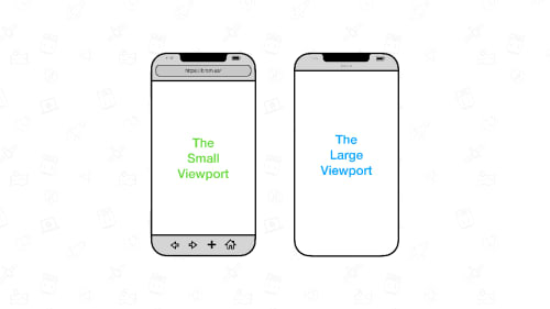
Small (svw and svh)
Use the small viewport units when you want the smallest possible viewport in response to browser interfaces like the address bar being expanded or visible.
Large (lvh and lvw)
Use the large viewport size when you want to use the full viewport with the browser interface being retracted or not visible. The large viewport size allows the content you design to fill the entire viewport when browser interfaces are retracting, however, the content might get hidden when browser interfaces expand.
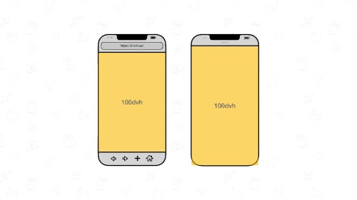
Dynamic (dvw and dvh)
Use the dynamic viewport size when you want the viewport to be automatically sized in response to browser interface changes. The value will be anything within the limits of 100lvh (maximum) and 100svh (minimum).
Default
The default viewport size is what the browser defines. The resulting behavior could be equivalent to the small viewport size, the large viewport size, an intermediate size between the two, or the dynamic viewport size.