
Designing with grids
I've been working on learning more about Grids used in book design and publishing and how it may be possible to apply them to web layouts.
Grids are not without challenges when working on the web. There are many form factors to consider which means we may have to use media queries to modify the layout
But let's start with the types of grids we may want to build or, in other words, what would we build grids for.
I've always said that there is no reason why the web can't be like print and newer CSS tools like grid, flexbox, writing modes, web fonts, container queries, and shapes among others, give us the flexibility to create beautiful layouts without sacrificing performance.
In writing this post I'm inspired by Andy Clarke, his book Art Direction for the Web and his series of presentations for Smashing Magazine members, inspired design decisions
Creating grids #
Creating grids is fairly straightforward. I work with two types of grids, what I call basic grids (defining a static number of rows and columns) and compound grids (overlapping two grids of different sizes on top of each other to create flexible layouts from the original grids).
Basic creation #
Creating a basic grid is simple. We just use code like the one below to create twelve equal columns and ten equal rows.
.container {
  display: grid;
  grid-template-columns: repeat(12, 1ft);
  grid-template-rows: repeat(10, 1fr);
  gap 10px;
}
The 1fr unit we used to define the template columns and rows is new to the Grid specification and it is defined as follows:
A flexible length or
is a dimension with the fr unit, which represents a fraction of the leftover space in the grid container. Tracks sized with fr units are called flexible tracks as they flex in response to leftover space similar to how flex items with a zero base size fill space in a flex container.
You can define grids with fixed column sizes. Rather than take equal amounts of space on the page, the next example creates twelve 100px columns, regardless of the size of the screen the grid is displayed in.
.container {
  display: grid;
  grid-template-columns: repeat(12, 100px);
  grid-template-rows: repeat(10, 1fr);
  gap: 10px;
}
We can also mix and match explicit dimensions with fr units to create more complex layouts.
For example, we can create a layout where the outermost columns are 300px each, and the inner columns are broken into four equal columns with something like this.
.container {
  grid-template-columns:  300px,
    repeat(4, 1fr),
    300px;
  grid-template-rows: repeat(
    10,
    1fr
  );
}
Minimal sizing, auto-fill, and auto-fit #
We can set up minimum width for the columns, making sure they don’t get too narrow using the minmax() function to define both minimum and maximum sizes.
In this example, each column will be 1fr as long as it's no smaller than 250px.
.container {
  grid-template-columns:
    repeat(12, minmax(250px, 1fr);
    )
}
Make sure that you test that this will work the way you want it to.
In the previous example, the columns may not wrap into new rows if the viewport width is too narrow to fit them all with the new minimum width requirement since we tell the browser that we want 12 columns.
To achieve wrapping, we can use the auto-fit or auto-fill keywords.
auto-fill will fill the row with as many columns as it can fit, creating implicit columns whenever a new column can fit. The newly added columns can and may be empty, but they will still occupy a designated space in the row.
auto-fit will fit the currently available columns into the space, expanding the columns so that they will take the available space. The browser does that after filling the extra space with extra columns and then collapsing the empty ones.
Named grid lines #
We can also name the lines that define the grids in the cell.
.container {
  grid-template-column:
    [line1-start] 100px
    [line2-start] 100px
    [line3-start] 100px
    [line4-start] 100px
    [line5-start] 100px
    [line6-start] 100px
    [end];
  grid-template-row:
    [row1-start] 25%
    [row1-end] 50%
    [row1-start] 25%
    [last-line];
}
If the column names are not necessarily a concern, you can use repeat to make the code shorter and easier to read.
The two definitions of .container are equivalent.
.container {
  grid-template-columns:
    repeat(3, [col-start] 20px);
}

.container {
  grid-template-columns:
    [col-start] 20px
    [col-start] 20px
    [col-start] 20px;
}
When using more than one column or row with the line name and the reference count.
.item {
  grid-column-start: col-start 2;
}
Named template areas #
We've looked at building grids with specific values for each cell either explicit values like 300px or fluid values like 1fr.
There is another way to define grids, using grid-template-areas.
The property specifies named grid areas, which are not associated with any particular grid item but can be referenced from the grid-placement properties.
Since you have to describe the content of each cell on the grid, the syntax of the grid-template-areas property also provides a visualization of the structure of the grid.
The possible values here are:
- A string, indicating the name of the area
- A period (
.) to indicate an empty or null cell
If the name repeats itself in concurrent areas, these cells will form an area that can be referenced.
In the example below we define a six-column by eight-row grid.
The head area takes the first two rows and spans all six columns
The nav area takes the first two columns and spans four rows. The main area sits to the right of nav and spans four columns.
The foot element presents a different placement case. The first two and the last two columns are empty (represented by a period, .) and the foot area only covers columns three and four, spanning two rows.
The only other thing to note is that all rows must define the same number of columns.
.container {
  display: grid;
  grid-template-areas: "head head head head head head"
  "head head head head head head"
  "nav nav main main main main"
  "nav nav main main main main"
  "nav nav main main main main"
  "nav nav main main main main"
  ". . foot foot . ."
  ". . foot foot . ."
}
Once we have defined the grid areas, we can place content in them.
The example continues by placing the direct children of .container into their corresponding areas. We can add further styles to each area.
.container > header {
  grid-area: head;
}
.container > nav    {
  grid-area: nav;
}
.container > main   {
  grid-area: main;
}
.container > footer {
  grid-area: foot;
}
Compound grids #
According to Andy Clarke in Inspired Design Decisions: Pressing Matters:
A compound grid is two or more grids of any type — column, modular, symmetrical, and asymmetrical — on one page. They can occupy separate areas or overlap.
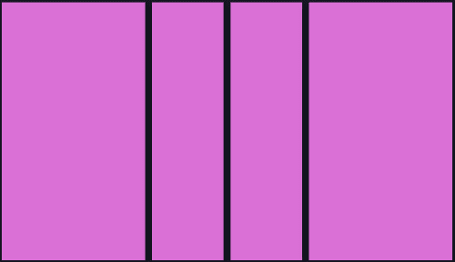
.container {
  display: grid;
  grid-template-columns: 2fr 1fr 1fr 2fr;
  grid-template-rows: repeat(10, 1fr);
}
.container {
  display: grid;
  grid-template-columns: 2fr 1fr 1fr 2fr 2fr 1fr 1fr 2fr;
  grid-template-rows: repeat(10, 1fr);
}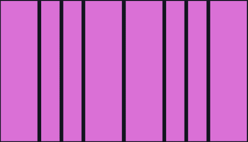
Creating compound grids is not easy. Rather than spend time doing it manually (and getting it wrong) I use the Compound Grid Generator from Michelle Barker
Placing items #
Now that we've created the grids, we can place items in them.
There are many different ways to place items in the grid.
We can place items in specific cells or spans of cells using grid-column-start, grid-column-end, grid-row-start, and grid-row-end or the shorthands grid-column and grid-row. You can also use the [span](grid-column grid-row) notation instead of the end column or row.
All three placements in the code below are equivalent.
The first one uses long-hand syntax.
The second declaration uses shorthand with specific beginning and ending values.
The third declaration uses span attributes to specify how many cells the item will span.
.item1 {
  grid-column-start: 2;
  grid-column-end: 6;
  grid-row-start: 6;
  grid-row-end: 9;
}

.item1 {
  grid-column: 2 / 6;
  grid-row: 6 / 9;
}

.item1 {
  grid-column: 2 / span 4;
  grid-row: 6 / span 3;
}
We can also rely on automatic placement. Once the grid is defined, all its children will be automatically placed on the grid.
This may be good in that the content will be automatically placed. It may also be bad because we can't necessarily know if the auto-placed content will overlap or not and how much.
For further information, check Exploring CSS Grid’s Implicit Grid and Auto-Placement Powers.
Subgrids #
When setting up a grid only the direct children of the element with display: grid become grid items. However, elements inside the grid items are displayed in normal flow and are not part of the grid.
You can "nest" grids by making a grid item a grid container. These grids do not take their track sizing from the parent grid. This makes it difficult to line nested grid items up with the parent grid.
If you set the value subgrid on grid-template-columns, grid-template-rows or both the nested grid uses the tracks defined on the parent.
This will solve the problem of lining items inside the grid items with the parent grid.
For more information see Subgrid in MDN
Notes and further work #
Knowing how to create grids and how to place items in them we can start combining them with media queries to create flexible layouts for multiple form factors.
Work with your designer in creating these layouts. We got a much larger toolbox than we did five years ago... now it's time to use it
Links and References #
- Using Grids in Interface Designs
- A Complete Guide to CSS Grid
- Exploring CSS Grid’s Implicit Grid and Auto-Placement Powers
- How To Build A Magazine Layout With CSS Grid Areas
- Compount Grid Generator — Michelle Barker
- Grid by Example
- Art Direction for the Web — Smashing Magazine
- Inspired by CSS Grid — London Web Standards
- Learn CSS Subgrid
- Subgrid — [MDN]