
Conference Reports: An Event Apart, San Francisco
I thought I was crazy when I saw that both An Event Apart and Books in Browsers were back to back on the same week and decided not to cancel. Now that BiB is almost done I'm kinda glad it did.
AEA gave me ideas and tools about the how to do design work and BiB is giving me ideas on what to work on and where to look for experiment ideas that may or may not fall squarely on the web.
AEA #
I've been promising to myself that I would attend An Event Apart for years. It all worked out this year and the lineup of speakers was particularly good. It was hard not to geek out as a fanboy with some of those people.
These are my thoughts and the ideas they generated.
Designing With Web Standards in 2016 — Jeffrey Zeldman #
Zeldman is, to me, a study in contrasts. He has been working on web design and web standards, is the author of the definitive book on desiging with web standards (first published in the midst of the browser wars) and has recently moved back to design and studio work.
He reminds us that none of the issues we face with technology and mobile technology in particular is not new.
We work with many form factors on our current websites. We forget, or choose not to remember, that we've had to deal with these issues before... Anyone remember these devices:

There were as many screen sizes when computers, laptops, notebooks, and PDAs were first introduced (anyone remember the Newton) and we were asked to design so it would look decent in all of them.
We worry about speed and performance... Does this look familiar?
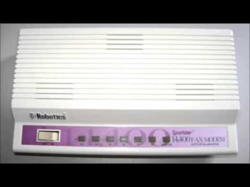
It's a 14.4 baud modem. It used to be top of the line when connecting to AOL. This was before ISPs were widespread and they were far slower that even the slowest mobile connection today.
That's the main point I took out from his presentation. We've solved these problems before, even if it's for a different audience. We're also getting better in solving these issues now that they rear their heads again.
We wonder if CSS is still necessary. We forget that:
- CSS survived table layouts
- CSS has lasted longer than Flash
- CSS can work across all available frameworks and can provide styles to accessible content.
We moan and complain about the bloat of frameworks like Bootstrap and Foundation and forget that the bloat used to be generated by editors like early versions of Dreamweaver and other commercial editors... let's nor forget earlier versions of Microsoft Office and how ugly was the resulting HTML and how people still used Word as their web editor... Frontpage anyone?
The need for good (and proper) design is more important now than ever. The changes are a matter of degree and perceived importance.
Practical Branding — Sarah Parmenter #
What is branding? Sarah's presentation talks about what makes a brand and not to forget that branding is way more than just a logo but it's the way we organize our content (images, colors, copy and layout ) and how we present that content to our intended audience.
Jon Gold asked the question in this tweet. Pay particular attention at the number of likes and retweets. It's sad that so many people agreed with him.
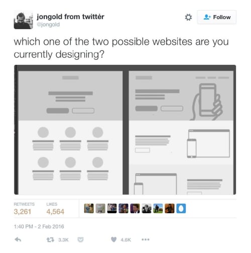
After seeing the response, Gold later stated:
I’m really upset with the state of our industry that this tweet has resonated so much. @jongold
Being creative doesn't mean having to reinvent the wheel every single time. It's ok to reuse material but we're selling ourselves and our field way short if that's all we do. That's been a theme throughout AEA. Be creative. The web has changed and now we can do designs that before were only print-based.
Links and Resources #
- Writting for the web
- Nielsen Norman Group Writing for the Web Research Reports
- 9 Tips For Brand Building With Web Design
New Users Matter, Too! Designing Better Onboarding Experiences — Krystal Higgins #
how do we on-board new users to our web experiences? What additional cues and affordances for first-time users of our applications?
What is the first thing your site tells or asks the user to do when they first visit?
Don't overload new users with offers to sign in, subscribe or agree to something before they've had the chance to review. Particularly if you're doing it sight unseen. To me there's nothing more anoying than getting to a site and getting a dialogue asking me to subscribe to a newsletter before I get to see the content.
We have limited time and opportunity to retain the users that come to our sites for the first time. Some ways we can retain our users:
Free content samples so that the users can see what they gain by joining your program, subscribe to your blog or otherwise decide to remain engaged with your site
Guided interactions provide additional guidance for first users (and a way to disable it if you don't needed) in interacting with your app or looking for content in your site.
Good guidance:
- Facilitates exploration in an authentic space
- Gradually engages
- Provides actionable next steps
Just don't become the office paper clip :-)
Links and Resources
Revolutionize Your Page: Real Art Direction on the Web — Jen Simmons #
New CSS Layout Meets the Real World — Rachel Andrew #
I've grouped these two together because they address some of the same subjects.
I started working on the web before there was CSS and Javascript and before there were layouts on the web. As such I've seen the evolution of layouts from no layout, to table layouts, to floats and now to flexbox and grid layouts.
Jen spoke about art direction in web design and how to do Editorial Design on our web pages. While I fully support tools and automation to create content (see the discussion about style guides below) I grew up when bespoke design was the rule rather than the exception.
I miss the whimsical and fun aspects of web design. We've stuck to the Holy Grail as our go to layout ever since we decided we don't want to do tables to do layouts anymore. As a result we created all sorts of frameworks (960.gs, Bootstrap, Foundation, SUSSY) to automate creating float-based layouts.
And now we get to modern technologies. Flexbox and Grid layouts provide tools to create radically different and flexible layouts. We've told ourselves for the longest time "The Web Is Not Print" as an excuse to cover that the web couldn't be print. We could not come anywhere near the complexity of print layouts.
We can now create as complex layouts as we can imagine. Some examples:
- We can create asymmetric layouts (say repeating 6 times a layout where the second column is twice as wide as the first one)
- we can create a fibonacci sequcen of sizes (for example repeating twice the sequence: 1, 1, 2, 3, 5, 8)
- Jazz at the Lincoln Center — Jen Simmons
- Mondrian — Jen Simmons
This is impossible to do with traditional float-based frameworks.
So now that we can go out and duplicate most (if not all) printed layouts why don't we? We can move away from the Holy Grail and create the layouts we imagine, not the layouts the browsers limit us to. More on this with Jen's workshop.
Rachel presented more concrete examples of using grids for production use cases. She presented step by step instructions for 3 different use cases in a way that made grid look and sound far less scary than it did before. As with many web technologies the basics are fairly easy... it's the advanced cases that get hairy
Links and Resources
- The Experimental Layout Lab of Jen Simmons
- 60 Stunning Pieces Of Editorial Design
- Editorial Design Pinboard
- Really Good Examples Of Editorial Design
- 10 rules for better editorial design
- 50 Incredible Editorial Designs From Around The World
- editorial design
- A Complete Guide to Flexbox
- Flexbox Image Gallery Experiment
- Complete guide to CSS Grid
Style Guide Best Practices * Brad Frost #
Consistent design is hard so we don't need to make it any harder than it needs to be. Pattern libraries help make thins easier by providing prepackaged "components" that you can drop in your pages. Atomic Design is one of those pattern libraries and it's implementation, Pattern Lab is a good example of how to use them.
I have to be honest. I've never particularly liked pattern libraries. I've always considered them as the independent developer's version of Bootstrap or Foundation. But we should still have some for of uniformity in our components... There are times when we have to provide a uniform set of components while still providing the ability to customize them when necessary.
In the future I hope we can use web components as pattern libraries that will not require third party code to run, only HTML, CSS and Javascript.
Links and Resources
- Atomic Design — design methodology
- Fractal component library tool
Evaluating Technology — Jeremy Keith #
Looking at some of the hot technologies out today like Service Workers and Web Components to ask broader questions about our evaluations cycles for new technologies. How does technology work and succeeds is the question we ask more often but we forget to talk about how well does technology fail.
This is particularly important when we start thinking about all the new and "greatest" technologies we need to take a step back and figure out if these new technologies work well for our target audiences and how, if they don't work, will the overall experience work for our users.
Take Service Workers for example. They are an awesome technology that lets you do offline caching and serves as the basis for further functionality such as background sync, push notification and others. If it works you get faster and reliable performance across devices and networks. But if it doesn't work users will still get the basic HTML, CSS and Javascript. They will not get the 'extra' stuff that Service Workers provide. This is to fail well.
The opposite example is a library that doesn't hold any content inside the script because all the content and structure is generated via Javascript. If it works the elements will be updated and everything will work perfectly but if, for any reason, Javascript doesn't load or times out you will get nothing... a bad fail.
Jeremy Keith calls for a more critical look at the technologies we use, how we use them or why we use them.
Links #
- Design Principles
- The Extensible Web Manifesto
- Developer Fallacies
- Service Workers
- My First Service Worker
- Making A Service Worker: A Case Study by Lyza Danger Garnder
- The Service Worker Lifecycle by Ire Aderinokun
- An Offline Experience With Service Workers by Brandon Rozek
- Offline Content With Service Workers by Mike Riethmuller
- Web Components
- Web Components
- Responsible Web Components
- Extensible Web Components
- Uncomfortably Excited by Alex Russell
- My Lightning Talk On Web Components by Soledad Penadés
- Practical Questions Around Web Components by Ian Feather
- Web Components And Progressive Enhancement by Adam Onishi
- Progressive Web Apps
- Home Screen
- Regressive Web Apps
- The Progressive Web App Dev Summit
- The Imitation Game
- Progressive Web Apps: Escaping Tabs Without Losing Our Soul by Alex Russell
- The Building Blocks of Progressive Web Apps by Ada Rose Edwards
- Progressive Web Apps: The Long Game by Remy Sharp
- What, Exactly, Makes Something A Progressive Web App? by Alex Russell
Motion In Design Systems: Animation, Style Guides, and the Design Process — Val Head #
I'm really starting to warmup to animation. With the Web Animation API or the Greensock library it's tempting to "animate all the things all the time". That may be good for games but it's definitely not ideal when working in the user interface and experience for our applications.
Val (along with Rachel Nabors and Sara Drasner ) have pushed forward the art of web animations. Val introduces concepts and techniques for working with animations to enhance the user experence.
Perhaps the biggest take away from Val's presentaiton, to me, was the need to communicate animation to the rest of the team.
Shared Vocabulary provides a common language to discuss and evaluate
Established Animation Values give you a common foundation
Documenting saves time and empowers others
Talk about animation early, often, and get as specific as you can
Part of this shared vocabulary and documentation includes sharing your ideas often, either as draft animations or as storyboards (the later is better in the early stages), so that the rest of the team knows what you're talking about when referin to animations and get an idea of what it will look like.
Adapting to Input — Jason Grigsby #
The way we interact with content has changed. It used to be that we only had to worry about mouse and keyboards. Those days are long gone...now we have to deal with everything from people using their fingers in a touch screen to audio interfaces, to new and interesting input methods in a varitey of devices and form factors.
Jason does a great job of introducing the new input technologies and walking us on how to prepare for them considering that, no matter how old the device and whether our support matrix says we support it or not, we should still provide at least a basic user experience for it.
Extreme Design — Derek Featherstone #
How can we be sure we’re creating the best design experiences possible? Design for accessibility first and you will find that the people in the middle will benefit as much, if not more, than the people the accommodations originally made for.
The easiest example is keyboard navigation.... we've gotten so used to being able to navigate apps via keyboard that we take for granted it will automatically happen whenever we create a new application. And it will, if we use the affordances provided in the HTML spec, but that's not always the case.
I built a Polymer application to list projects I was working on. It works (although it takes forever to load) but a few months later, while watching Rob Dodson's A11Y casts, I tried using the keyboard to navigate the app... and absolutely nothing. It didn't work at all. I've realized over time how easy is to take accessibility for granted but we need
Compassionate Design — Eric Meyer #
When we design we design for the best case scenario but that's not always what we get. Say, for example that you're looking at a Hospital website looking for directions on how to get to the emergency room after a loved one was driven in an ambulance; you're distraught and full of worry and not really in the mood to have to search over entire
Top Task Management: Making it Easier to Prioritize — Gerry McGovern #
In this age of more and conflicting priorities, when all we do is add features to an app or content to a site it is hard to know what is important (as in must be in the site) versus what might be important. It is also very hard to separate what we think will be important from what the users will actually need from our application.
Content inventories and user surveys help with a lot of these tasks.... but we still have to work at prioritizing the content we put on our sites and giving users what really matters, to them.
Designing Layouts: The New Superpowers of CSS — Jen Simmons #
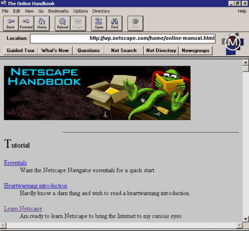
I started working on the web when there was no styling and no layout. Does anyone remember this:
Spending a full day with Jen talking about layouts is just about the most amazing experience I've had as a developer. We went through so many things... writing modes, different ways to create vertical text, moving text on the screen, columns, grids, regions (soon) and so many other things that makes layouts attractive and egaging again.
We can no longer hide behind the fact that the technology is not there to do layouts that are just as stunning as those in print. We're n ot quite 100% of the way there but we're way closer than we've ever been