
Colors in CSS, Contrast and, Testing
When we talk about visual disabilities we usually concentrate on color blindness without realizing that that are other visual accessibility issues that we tend to ignore.
This came to bite me when I was testing a page using Chrome Dev Tools accessibility Test (process fully described in Accessibility: Test your content) where the color of my code blocks (using Prism and the Solarized light theme) were not providing enough contrast between text and background.
At an instinctual level I understand why this is important but how much contrast is too little and how do I measure it? What role does color play in contrast and accessibility?
The contrast between the text and background colors and Luminosity (how bright the colors are on the page) are important for people with colorblindness or low vision.
The bright light from a screen or other sources prevents some people with low vision (including those with photophobia and with reading disabilities such as dyslexia) from reading and causes pain for some people. Some people turn down the brightness of their screen or use an overlay. For other people, it is easier to read with a bright screen, and they sometimes increase the brightness, especially on mobile devices.
Other people need high contrast between text and background, including many older people who lose contrast sensitivity from aging. Some read better with dark text on light background.
For some people, common color combinations or colors from a limited color palette work fine, for example, black text on white background or the inverse with white text on black background. Other people need to select a more specific background and text colors. For example, people who need low brightness overall, need to select the specific background and text colors that provide sufficient contrast for them yet not too high brightness. Readable and optimal color combinations differ vastly among individuals and can even vary for one individual depending on conditions such as fatigue and lighting.
Some modern designs, however, are so "subtle" that the contrast can actually be insufficient for some readers. Examples include contrasting light grey versus middle grey, middle pastels versus darks, or white versus light cyan (blue-green).
Testing for contrast #
The WCAG has the following recommendations for contrast ratio and font sizes:
- Text that is considered small – approximately equivalent to 1.2em or 120% of the default body text size – should have a contrast ratio of at least 4.5 : 1 to its background
- Text that is 1.2 ems or higher and bolded, or normal text that is 1.5 em / 150% in size or greater, should have a contrast ratio of at least 3 : 1
How do we test these values? How do we know if they pass WCAG testing?
There are tools to test contrast between text and background colors but, until recently, they relied solely on hexadecimal colors. With designers increasingly using rgb, and hsl CSS color systems combined with transparency make the testing harder. Newer tools allow you to test the contrast level of your web pages versus WCAG guidelines even with transparency or when using different types of colors. Out of the tools, I found I chose to use Lea Verou's easy color contrast tool. It also supports working with transparent colors using HSLA and RGBA. I've provided links to other tools in the links section at the end of the post.
Solutions #
Unfortunately, this is an area where we can't really provide a one size fits all solutions because there are different types of visual disabilities that we have to account for.
So we need to work together with users when it comes to providing a good experience for people with visual disabilities. Some of the ideas below are things for the designers/developers to do and others are for users to implement and use.
Manual Testing for Color Contrast #
The best way to test color contrast is to actually test the colors you want to use. I've chosen to use Lea Verou's Contrast Testing Tool as my primary testing tool. This will give us both color contrast and the possibility of playing with other color combinations.
It also works with colors outside the 3 or 6-color hexadecimal values. It works with HSL, HSLA, and, RGBA. So the playground for experimentation grows even bigger.

This is the first tool in our testing arsenal.
Automatic Color Contrast Testing #
The easiest way is to test your site for accessibility using automated tools. Tools like Lighthouse, aXe and aXe Coconut will get you started with accessibility testing.
I put it after manual testing rather than as the first idea about how to test contrast because I use manual testing is to decide what colors to use (foreground versus background).
I use the accessibility testing integrated into Dev Tools Audits menu. Figure 2 (below) shows the result of the accessibility testing.
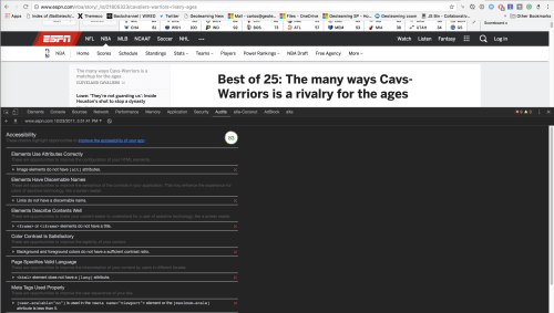
Lighthouse Accessibility Testing Report
Automated tools are awesome but they are far from complete. There are many accessibility checks that you must perform manually, either because it's hard to get the values programmatically or because it requires human judgment whether the rule passes or not.
Links and Resources #
- About Colors on The Web
- Color Contrast and Accessibility
- Color Formats in CSS
- Color Contrast Testing