One of the reasons to move my blog from WordPress to Eleventy was the flexibility of convert the Markdown I write into proper HTML without using raw HTML in the Markdown files.
But adding Markdown-it plugins mean additional syntax to remember and different ways to use established Markdown-it syntax.
This document is my attempt at remembering all the things I've added so I can continue to use them.
This post is my attempt at a cheat sheet for the extra Markdown Elements that I use in this blog.
!!! tip **This post is specific to this site**
The commands, as explained in this post, are designed for this blog and will only work as explained here.
If you want to get them to work in your own site contact me and I'll try to help.
!!!
## Front matter attributes
I don't need video embeds, Mermaid or Mavo on every page so I don't load them. I use conditional nunjuck tags to only load them if there is a matching tag in the post's front matter.
For example, the tags supporting `lite-youtube` video embeds will only load if the front matter for the post has a `youtube` attribute set to true
A front matter declaration supporting all the conditional loads would look like this:
```yaml
---
title: "My Markdown cheatsheet"
date: "2023-10-15"
youtube: true
vimeo: true
mermaid: true
mavo: true
---
```
### Handling drafts and future postings
One thing that has been very frustrating is to figure out how to handle drafts and future posts (posts that are complete but will not be published for a while).
if you set `draft: true` in the post front matter or the date is in the future from the date you're publishing. Eleventy will set the permalink to false and exclude the post from all collections
## Attributes
This plugin will insert the specified attributes to the element. If the class exists the look of the content may change.
For example:
The following Markdown code:
```markdown
column1 | column2
--- | --- |
Read | Write
{.special}
```
Will insert the `.special` class into the table. Inspect the code to see the result.
column1 | column2
--- | --- |
Read | Write
{.special}
While the Markdown below will change the markers to use a customized CSS list number style.
```markdown
1. 22354
2. 54252
3. 1231231542
{.custom-ordered}
```
1. 22354
2. 54252
3. 1231231542
{.custom-ordered}
## Figures
Using the figure plugin. Eleventy will generate full `figure` elements with a caption using the `figcaption` element.
The following Markdown code:
```markdown

```
Will produce this HTML:
```html
caption and alt text
```
This will handle both native lazy loading and third-party lazy-loading scripts that require a class attribute to be present for them to work.
Also note the use of the [decoding](https://developer.mozilla.org/en-US/docs/Web/API/HTMLImageElement/decoding) property to load the image in prallel with the rest of the page so text may render before images have finished loading... score!
One drawback is that, as configured, the plugin will use the same text for both the `alt` attribute and the content of the `figcaption` element. This is likely not a good idea but I'm still working on possible solutions
## Definition lists
Definition lists consist of two parts wrapped in a list definition (`dl`), the term (using the `dt` element) and one or more definitions (using the `dd` element).
The Markdown version looks like this:
```markdown
term1
: First paragraph of the definition
: Second paragraph of the definition
term2
: First paragraph of the definition
: Second paragraph of the definition
```
It will produce the following HTML code:
```html
Term1
First paragraph of the definition
Second paragraph of the definition
Term2
First paragraph of the definition
Second paragraph of the definition
```
term1
: First paragraph of the definition
: Second paragraph of the definition
term2
: First paragraph of the definition
: Second paragraph of the definition
You can have multiple definitions for a term and there is no length limit for each definition
## kbd elements
[kbd](https://developer.mozilla.org/en-US/docs/Web/HTML/Element/kbd) represents keyboard input, for example key combinations to run a command.
```markdown
Run [[cmd]] + [[shift]] + [[R]] on macOS
Run [[ctrl]] + [[shift]] + [[R]] on Windows.
```
Will produce the following HTML
```html
Run ⌘ + ⇧ + R on macOS
Run ⌃ + ⇧ + R on Windows to reload the browser window.
```
Run [[cmd]] + [[shift]] + [[R]] on macOS
Run [[ctrl]] + [[shift]] + [[R]] on
The `kbd` plugin will convert some words into symbols. `cmd` is transofrmed to `⌘`, shift to `⇧` and ctrl to `^`.
I'll evaluate if this is still what I want after I've had the chance to run it for a while.
## Footnotes
Footnotes are made of two parts, the callout in the text and the footnote text.
The callout is surrounded by square brakets with a `^` and the marker that we want to use. For example `[^1]` is a valid marker
The footnote text begins with the same callout that we used in the text followed by a colon, like this `[^1]:`, followed by one or more paragraphs of text.
It doesn't matter where we put the foonote, it will be moved to the end of the document and displayed in sequential oder.
```markdown
The text that needs a footnote goes here. [^1]
[^1]: This is the text of the footnote.
```
The punctuation is important. If you miss the colon on the footer text then the footnote will be displayed as is. This is definitely not what you want.
The text that needs a footnote goes here. Look for the footnote at the bottom of the page. [^1]
[^1]: This is the text of the footnote.
## Admonitions
Admonitions are asides with relevant information that are not essential to the body of the text.
The following types of admonitions are supported:
* info
* note
* tip
* warning
* bug
* danger
* failure
* success
The structure is the same:
1. Three exclamation marks, `!!!` followed by the `type` of admonition and an optional title
1. If you don't provide a title, then the type of admonition will be used
2. The body of the admonition
3. Three exclamation marks, `!!!` on a line of their own
A `warning` admonition would look like this
```markdown
!!! warning
You never know who'll get to read it :)
!!!
```
```html
warning
It works so much better when you do your research before engaging in arguments
```
!!! warning
You never know who'll get to read it :)
!!!
You can also add a title to the admonition by adding the title after the type of admonition.
To add a title to the warning example, the modified code will look like this:
```markdown
!!! warning Do your research
You never know who'll get to read it :)
!!!
```
And the resulting HTML will look like this:
```html
Do your research
You never know who'll get to read it :)
```
!!! warning Do your research
You never know who'll get to read it :)
!!!
## lite-youtube and lite-vimeo
`lite-youtube` and `lite-vimeo` are not Markdown and require Javascript to run, but they will improve the performance of pages.
Each of these custom elements reduce the number of HTTP requests the browser makes to render the video.
Because I'm adding the scrips to the rendered pages, I've followed the suggestions in [Efficiently load Javascript with defer and async](https://flaviocopes.com/javascript-async-defer/) and place the scripts in the `head` of the page and add the `defer` attribute.
### YouTube
The `lite-youtube` custom element embeds a YouTube embedded iframe.
It takes `videoid` attribute with the ID of the video we want to play and a `params` attribute indicating any custom iframe attribute that we want to pass. In this case we want to override the default autoplay behavior and have it **not** autoplay at all.
```html
```
### Vimeo
The `lite-vimeo` custom element will embed a Vimeo video player.
It takes a single `videoid` attribute representing the ID of the video we want to play.
```html
```
Unlike `lite-youtube`, `lite-vimeo` requires CSS to size the video to what we want.
I've chosen to style the custom element directly rathe than create a container class for it.
```css
lite-vimeo {
width: 720px;
max-width: 720px;
height: auto;
}
```
## Special table formatting
Basic Markdown table support is good for basic tables but it doesn't work for more complex tables where cells span rows and/or columns.
For a full reference see [MultiMarkdown Table Syntax](https://fletcher.github.io/MultiMarkdown-6/syntax/tables.html)
This example adds multiple headings at the top of the table, cells spanning more than one column and a caption for the table at the bottom, below the content.
```markdown
| | Grouping ||
| First Header | Second Header | Third Header |
------------ | :-----------: | -----------: |
Content | *Long Cell* ||
Content | **Cell** | Cell |
New section | More | Data |
And more | With an escaped '\|' ||
[Prototype table]
```
And the resulting table, with all the table formatting done in CSS, looks like this:
| | Grouping ||
First Header | Second Header | Third Header |
------------ | :-----------: | -----------: |
Content | *Long Cell* ||
Content | **Cell** | Cell |
New section | More | Data |
And more | With an escaped '\|' ||
[Prototype table]
## Web Components
### color.js elements
#### color-picker
The [color-picker](https://elements.colorjs.io/src/color-picker/) elements displays a slider-based color picker that will display the selected color. It will also fire events that will enable you to use the color you picked in styles for other parts of the page.
This code:
```html
```
Will produce the following result:
The [color-picker reference](https://elements.colorjs.io/src/color-picker/#reference) for the component's API.
#### color-scale
The [color-scale](https://elements.colorjs.io/src/color-scale/) component provides a visual representation of a color scale presented in the `colors` attribute.
You can enter the colors in any color space supported in color.js. The component will convert the colors to the space specified in the `space` attribute.
This code:
```html
```
Will produce the following result:
There is no actual API since this is a presentational element but you can check the [color-scale](https://elements.colorjs.io/src/color-scale/) page for more information on what attributes are available.
#### color-swatch
The [color-swatch](https://elements.colorjs.io/src/color-swatch/) element creates color swatches that can be edited if so configured.
The input file inside the `color-swatch` component will render the value of the selected color.
This code:
```html
```
Will render the following result:
#### color-inline
The [color-swatch](https://elements.colorjs.io/src/color-swatch/) element renders a swatch of color inline with other content like text.
```html
This will render the color
lch(50% 40 30) inline.
```
This will render the color lch(50% 40 30) inline.
See the [color-inline reference](https://elements.colorjs.io/src/color-inline/#reference) for the component's API.
### Baseline
```html
```
## Adding Images
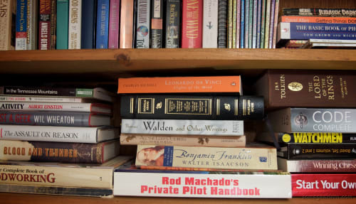
Because I'm using Cloudinary to host my images, there are some special attributes that must be added to the image URLs to get the desired results.
The `src` attribute is broken into multiple lines for clarity but it must be a single line in the actual code.
The full syntax for adding an image is:
```html
```
Where:
* `https://res.cloudinary.com/dfh6ihzvj/` is the base URL for my Cloudinary account
* `image/upload/` is the standard path for uploaded images
* `c_scale,w_500/` is the transformation to scale the image to a width
* `f_auto,q_auto/` are the transformations to have Cloudinary deliver the image in the optimal format and quality for the browser requesting it
* `3484353131_016dd32be7_o` is the public ID/Name of the image in Cloudinary
The resulting image will be scaled to 500 pixels wide, with the height adjusted to maintain the original aspect ratio, and delivered in the best format and quality for the requesting browser.
I'm evaluating whether to stay in Cloudinary or move to another image hosting service or self-host the images using my . The main reason is cost as my usage has increased over time.

 ```
Where:
* `https://res.cloudinary.com/dfh6ihzvj/` is the base URL for my Cloudinary account
* `image/upload/` is the standard path for uploaded images
* `c_scale,w_500/` is the transformation to scale the image to a width
* `f_auto,q_auto/` are the transformations to have Cloudinary deliver the image in the optimal format and quality for the browser requesting it
* `3484353131_016dd32be7_o` is the public ID/Name of the image in Cloudinary
The resulting image will be scaled to 500 pixels wide, with the height adjusted to maintain the original aspect ratio, and delivered in the best format and quality for the requesting browser.
I'm evaluating whether to stay in Cloudinary or move to another image hosting service or self-host the images using my . The main reason is cost as my usage has increased over time.
```
Where:
* `https://res.cloudinary.com/dfh6ihzvj/` is the base URL for my Cloudinary account
* `image/upload/` is the standard path for uploaded images
* `c_scale,w_500/` is the transformation to scale the image to a width
* `f_auto,q_auto/` are the transformations to have Cloudinary deliver the image in the optimal format and quality for the browser requesting it
* `3484353131_016dd32be7_o` is the public ID/Name of the image in Cloudinary
The resulting image will be scaled to 500 pixels wide, with the height adjusted to maintain the original aspect ratio, and delivered in the best format and quality for the requesting browser.
I'm evaluating whether to stay in Cloudinary or move to another image hosting service or self-host the images using my . The main reason is cost as my usage has increased over time.