
Evolving Complexity: Design
I've always believed that there is no reason not to make our designs look like print. What makes a good print design (and an acceptable web equivalent) has changed over time. What looked good in 1994: May not look as good as a modern site or application. Just like our authoring tools and technologies, the design and layout techniques changed based on what we had available at the time. This is what a table-based layout in the early 1990's looked like. It used tables for layout and 1x1 spacer gif images. ```html
| Hello welcome to my |
This example works just like the last one. Notice we
put a clearfix on the container. It's not
needed in this example, but it would be if the
nav was longer than the non-floated content.
Lorem ipsum dolor sit amet, consectetur adipiscing elit. Phasellus imperdiet, nulla et dictum interdum, nisi lorem egestas odio, vitae scelerisque enim ligula venenatis dolor. Maecenas nisl est, ultrices nec congue eget, auctor vitae massa.
.four.columns
.four.columns
.four.columns
.six.columns
.six.columns
.twelve.columns
4
4
4
4
8
6
6
12
 ```
You can also size images relative to the overall page width.
For example, let’s say you had an image that had a natural size of 500px × 300px in a 1200px wide document. Below 1200px, the document will be fluid. The calculation of how much width the image takes up as a percentage of the document is easy:
```
(500 / 1200 ) × 100 = 41.66%
```
```html
```
You can also size images relative to the overall page width.
For example, let’s say you had an image that had a natural size of 500px × 300px in a 1200px wide document. Below 1200px, the document will be fluid. The calculation of how much width the image takes up as a percentage of the document is easy:
```
(500 / 1200 ) × 100 = 41.66%
```
```html
 ```
Dudley Storey's [The New Code](http://thenewcode.com) has an article on [CSS Fluid Image Techniques for Responsive Site Design](http://thenewcode.com/586/CSS-Fluid-Image-Techniques-for-Responsive-Site-Design)
The final element of our responsive web design is [Media Queries](http://cssmediaqueries.com/). These are a CSS feature that lets you adjust or flat out change CSS selectors and rules based on criteria you choose.
In this example, taken from [http://cssmediaqueries.com/](http://cssmediaqueries.com/) we can see two different media queries in action.
- The first query is triggered when the width of the screen is 1200px or wider. If true we swap the original image with a larger version.
- The second query only triggers when we print the page. We then remove the image altogether to save on toner or ink.
The idea is that we can tailor the content to the devices we are targeting without having to write entire sites dedicated to each class of devices we're targeting.
```css
/* normal style */
#header-image {
background-repeat: no-repeat;
background-image: url('image.png');
}
/* show a larger image when you're on a big screen */
@media screen and (min-width: 1200px) {
#header-image {
background-image: url('large-image.png');
}
}
/* remove header image when printing. */
@media print {
#header-image {
display: none;
}
}
```
We are getting closer to the present. Thanks to the CSS working group and the willingness of browser vendors to work towards uniform specification support we can see the CSS we write become, slightly, easier.
CSS Variables allow you to create custom reusable elements directly in CSS. In this example the [:root](https://css-tricks.com/almanac/selectors/r/root/) defines a `--main-color` variable.
We can reuse the variable anywhere in the style sheet. In this case we use it in the `h1` element with the [var()](https://developer.mozilla.org/en-US/docs/Web/CSS/var) syntax.
```css
:root {
--main-color: #06c;
}
#foo h1 {
color: var(--main-color);
}
```
We can use CSS variables to create color themes and a set of breakpoints. We define them in the `:root` element and then use them throughout the style sheet, without having to use SASS or Less or Stylus.
Flexbox is a single dimension layout tool that allows you to create layouts that are responsive by default.
The CSS defines 3 selectors:
- `.boxes` is the container for the flex elements. All its children automatically become flex items
- `.box` is the individual flex item. The most important rule is the width. This is what the wrapping will be based on
- The `img` element inside the boxes is set up as a fluid image taking 100% of the parent's width
```css
.boxes {
padding: 0.5vw;
flex-flow: row wrap;
display: flex;
}
.box {
margin: 0.5vw;
border: 1px solid #444;
padding: 0.5vw;
flex: 1 0 auto;
width: 300px;
}
.box img {
width: 100%;
height: auto;
}
```
The HTML uses the element we defined and it adds an extra class to each box so we can style it independently. We might want to add individual backgrounds based on position or make other changes to individual blocks of content.
```html
```
Dudley Storey's [The New Code](http://thenewcode.com) has an article on [CSS Fluid Image Techniques for Responsive Site Design](http://thenewcode.com/586/CSS-Fluid-Image-Techniques-for-Responsive-Site-Design)
The final element of our responsive web design is [Media Queries](http://cssmediaqueries.com/). These are a CSS feature that lets you adjust or flat out change CSS selectors and rules based on criteria you choose.
In this example, taken from [http://cssmediaqueries.com/](http://cssmediaqueries.com/) we can see two different media queries in action.
- The first query is triggered when the width of the screen is 1200px or wider. If true we swap the original image with a larger version.
- The second query only triggers when we print the page. We then remove the image altogether to save on toner or ink.
The idea is that we can tailor the content to the devices we are targeting without having to write entire sites dedicated to each class of devices we're targeting.
```css
/* normal style */
#header-image {
background-repeat: no-repeat;
background-image: url('image.png');
}
/* show a larger image when you're on a big screen */
@media screen and (min-width: 1200px) {
#header-image {
background-image: url('large-image.png');
}
}
/* remove header image when printing. */
@media print {
#header-image {
display: none;
}
}
```
We are getting closer to the present. Thanks to the CSS working group and the willingness of browser vendors to work towards uniform specification support we can see the CSS we write become, slightly, easier.
CSS Variables allow you to create custom reusable elements directly in CSS. In this example the [:root](https://css-tricks.com/almanac/selectors/r/root/) defines a `--main-color` variable.
We can reuse the variable anywhere in the style sheet. In this case we use it in the `h1` element with the [var()](https://developer.mozilla.org/en-US/docs/Web/CSS/var) syntax.
```css
:root {
--main-color: #06c;
}
#foo h1 {
color: var(--main-color);
}
```
We can use CSS variables to create color themes and a set of breakpoints. We define them in the `:root` element and then use them throughout the style sheet, without having to use SASS or Less or Stylus.
Flexbox is a single dimension layout tool that allows you to create layouts that are responsive by default.
The CSS defines 3 selectors:
- `.boxes` is the container for the flex elements. All its children automatically become flex items
- `.box` is the individual flex item. The most important rule is the width. This is what the wrapping will be based on
- The `img` element inside the boxes is set up as a fluid image taking 100% of the parent's width
```css
.boxes {
padding: 0.5vw;
flex-flow: row wrap;
display: flex;
}
.box {
margin: 0.5vw;
border: 1px solid #444;
padding: 0.5vw;
flex: 1 0 auto;
width: 300px;
}
.box img {
width: 100%;
height: auto;
}
```
The HTML uses the element we defined and it adds an extra class to each box so we can style it independently. We might want to add individual backgrounds based on position or make other changes to individual blocks of content.
```html
Example Flexbox Gallery
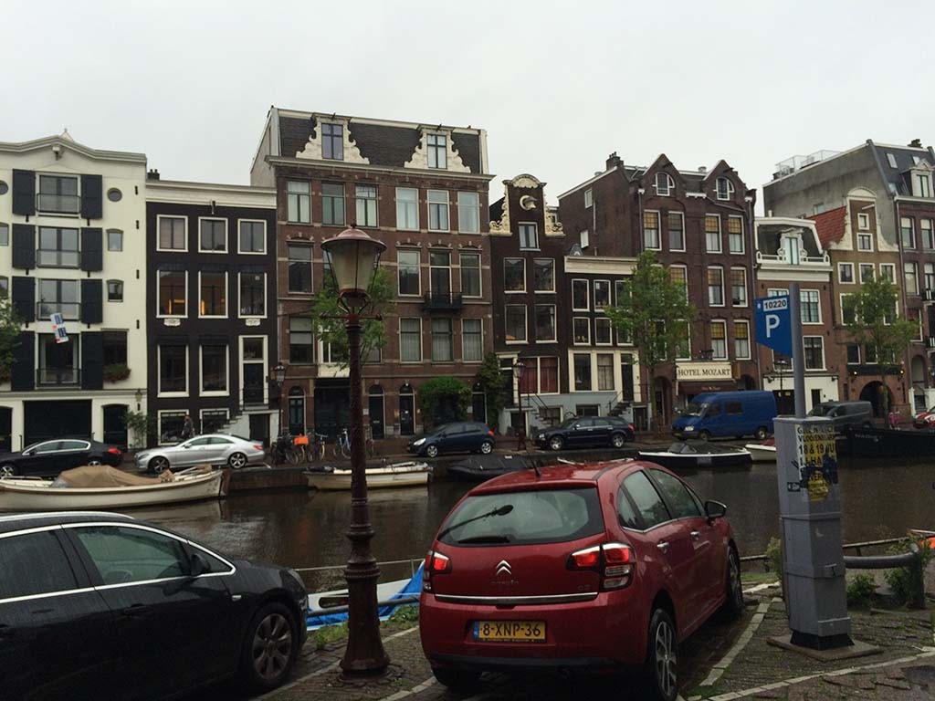
The architecture rocks
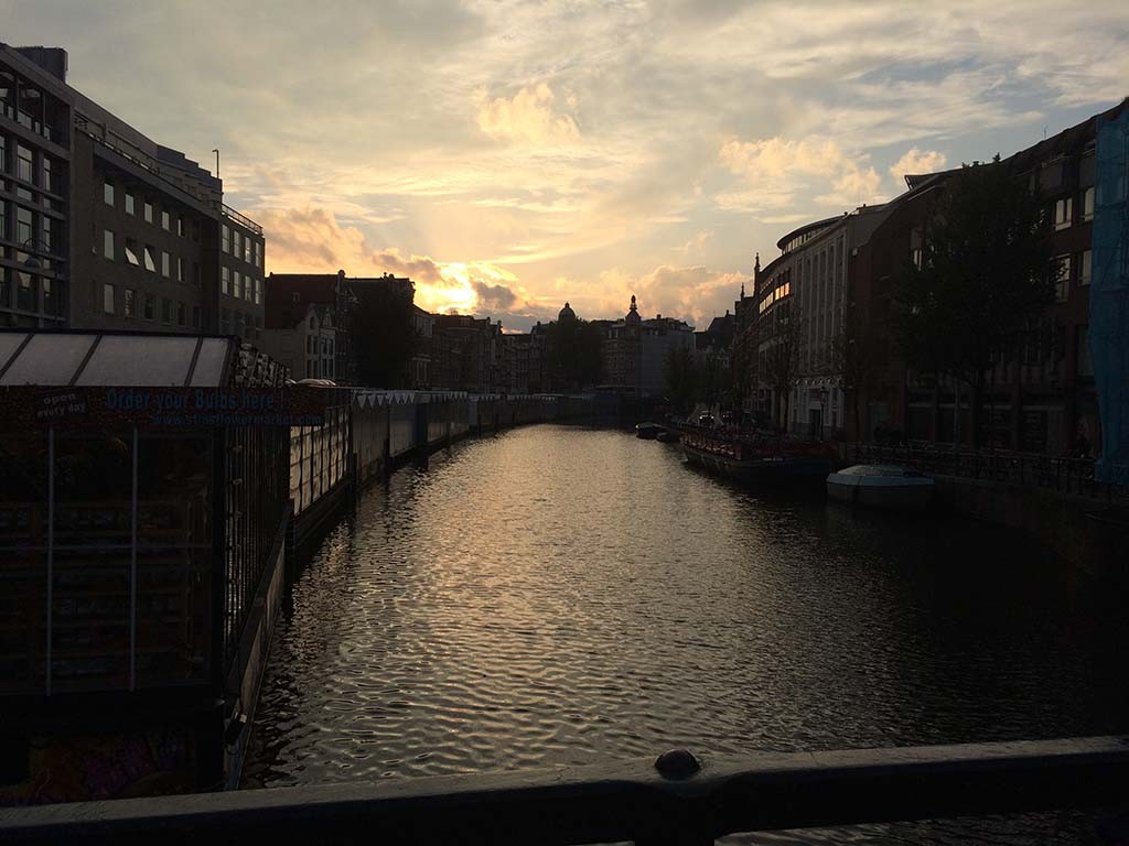
Amsterdam Sunset
...
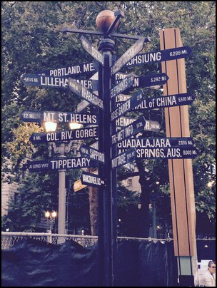
Portland Signpost
...
A
B
C
D
E
F