
Be mindful of ch units
I think ch units in typography are cool, but there was something about them that I hadn't thought about and is something that may impact your site's performance metrics.
This post will explore ch units, what they are and what they do.
It will also discuss a problem presented by Silvestar Bistrović in Be careful with ch units along with a possible solution.
What are ch units #
According to the W3C's CSS Values and Units Module Level 3 candidate recommendation, the 'ch unit':
Represents the typical advance measure of European alphanumeric characters, and measured as the used advance measure of the “0” (ZERO, U+0030) glyph in the font used to render it. (The advance measure of a glyph is its advance width or height, whichever is in the inline axis of the element.)
The specification also reminds us that the advance measure of a glyph depends on writing-mode and other factors that affect glyph selection or orientation. So we need to be careful here.
What is the problem #
The problem can be summed up in: Not all fonts are the same.
When I use ch units in my code, I normally do so to set the measure or width, of my text; something like the following CSS:
body {
  font-family: Raleway, sans-serif
}

.content {
  line-height: 1.2;
  width: 80ch;
}
And this will work perfectly as long as Raleway loads successfully and it's properly cached, either in the browser cache, or in a service worker.
But what happens if it doesn't load or the browser times out waiting for Raleway to load? What happens a fallback font is significantly different than the primary font we specify for our stack?
As Silvestar Bistrović outlines in Be careful with ch units, the size of the ch unit is based on the font.
Since not all fonts are designed the same, a measure of 66 characters can look narrower or wider depending on the typefaces you choose for your primary and fallback fonts.
Unless you're careful in planning your site's font stack, this will cause your layout to shift when the primary font loads and affect your Core Web Vitals metrics.
Possible solutions #
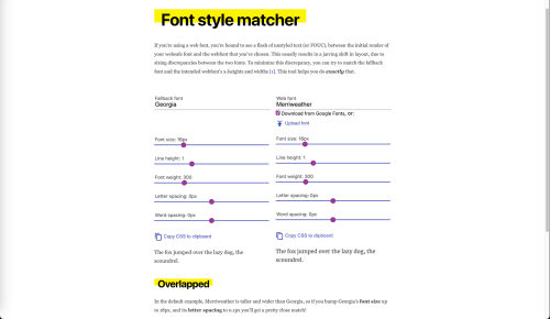
Monica Dinculescu created a font style matcher to create font-related styles to make fonts more closely match each other.
A more modern approach involves attributes of the @font-face at-rule.
The different values of the font-display descriptor control the interaction between a fallback font and the web font it replaces.
You can use the values for the web font's override descriptors (ascent-override, descent-override, and line-gap-override) in the fallback fonts to reduce or eliminate vertical shift.
Generating these override values is not trivial and requires developers to be familiar with font tables and which one to use when calculating the overrides.
Fortunately, tools like Fontaine can automate the process of generating backup fonts with the correct override metrics.