
Looking at animations again... 3 ways to animate content on your page
We've been able to animate content both in 2D and 3D for a while now. The animation effects range from the subtle UX enhancements like material design ripples for buttons and floating action buttons to full on web motion comics, animation exercises and music videos like the example below from Rachel Nabors.
The simplest way of understanding an animation is that it is the change of presentational aspects of an element (height, width, color, etc.) over time. In short, animations are presentation, even if prior to CSS3 Transitions and Animations, they could only be achieved via JavaScript.
See the Pen Complete CSS3 + HTML5 music video by Rachel Nabors (@rachelnabors) on CodePen.
For this post I will concentrate in 2D animations since they are the ones with the biggest return of investment for the work we will do.
The post is divided in three sections:
- Using CSS 2D animations
- Using the Web Animation API
- Using GSAP (Green Sock Animation Platform)
Using CSS 2D animations #
The easiest way to create an animation is using CSS. All CSS animations are keyframe based meaning that you write the number of steps that you want to use and what the status for the property you're animating is at each one of those steps.
At its simplest a web animation looks like this with the following HTML representing the object I want to animate:
<div class='box'></div>And the CSS below defining three items for our animation
-
The dimensions of the object we want to animate (
heightandwidth) -
An animation property that defines:
- The name of the animation
- How long does it last
- How many times it repeats itself
When defining the element we want to animate we give it the animation properties using the animation property. In the first example we use the animation shorthand property to indicate the name of the animation, how long do we want it to last and the direction we want it to move in (in this case we tell it to alternate forward and back).
/* Defines the object we'll animate */
.box {
  height: 100px;
  width: 100px;
  background-color: rebeccapurple;
  animation: move 2s 5 alternate;
}
You can also specify individual properties for each characteristic of the animation. The example below is equivalent to the one above but spells out each of the properties for the animation.
.box {
  height: 100px;
  width: 100px;
  background-color: rebeccapurple;
  animation-name: move;
  animation-duration: 2s;
  animation-iteration-count: 5;
  animation-direction: alternate;
}
We'll discuss this in more detaul when we talk about the animation shorthand versus long hand syntax.
We then define the keyframes for our animation as two or more steps indicated by percentages and the condition we want for the property that stag e of the animation. In the example below we define a minimal @keyframes with an ending step (100%) with the background color #ff4136. We could add a starting keyframe (0%) with the initial color but the initial color for our box is already defined so a keyframe with it is not necessary.
@keyframes pulse {
  100% {
    background-color: #ff4136;
  }
}
We can also setup multiple steps of the animation together if they have the same value. In this example both the initial and final keyframes (0% and 100%) have the same background color so we can chain them together using their values in a comma separated list... we could omit the 0% value in our keyframes since the color is initially defined in the selector but I'd rather be redundant than confused.
/* defines the animation keyframes*/
@keyframes pulse {
  0%, 100% {
      background-color: rebeccapurple;
  }
  50% {
    background-color: #FF4136;
  }
}
How many keyframes do we need? #
Thanks to Rachel Nabors for answering questions I had about this.
This is a tricky question that depends a lot on the effect that you want to accomplish. Generally you only need as many keyframes as it takes to express the animation concisely and you can omit initial and ending values (0% and 100%) when it's safe to do so and depending on the property or properties that you're animating; if the default value for the property is none rathern than 0 then you do want an initial value.
Compare an animation like the one below with only three steps (Codepen: http://codepen.io/caraya/full/RKWwpR/)
@keyframes move {
  25% {
    margin-left: 25px;
  }

  50% {
    margin-left: 50px;
  }

  100% {
    margin-left: 100px;
  }
}
And the same animation with 10 steps (Codepen: http://codepen.io/caraya/full/JEYKyg/)
@keyframes move {
  10% {
    marging-left: 10px;
  }

  20% {
    margin-left: 20px;
  }

  30% {
    margin-left: 30px;
  }

  40% {
    margin-left: 30px;
  }

  50% {
    margin-left: 50px;
  }

  60% {
    margin-left: 60px;
  }

  70% {
    margin-left: 70px;
  }

  80% {
    margin-left: 80px;
  }

  90% {
    margin-left: 90px;
  }

  100% {
    margin-left: 100px;
  }
}
Again the number of steps for your animation will depend on what your objective is and how smooth your animation has to be. The animation for a three pulse ripple-like effect needs less steps than a polished animation like Rachel Nabors' Alice in Wonderland.
Step based animation may be another alternative to using (too) many keyframes.
Can we change the way an animation plays? #
CSS animations have several timing functions and allows for custom bezier-curve based animations. The attribute that controls the timing function is animation-timing-function.
The predefined values are the following:
.foot {
  animation-timing-function: ease;
}

.foot {
  animation-timing-function: ease-in;
}

.foot {
  animation-timing-function: ease-out;
}

.foot {
  animation-timing-function: ease-in-out;
}

.foot {
  animation-timing-function: linear;
}

.foot {
  animation-timing-function: step-start;
}

.foot {
  animation-timing-function: step-end;
}
We can also create custom animations using custom Bezier Curves to create the type of animation you want to have. Lea Verou create a Bezier Curve Generator to make it easier to generate custom bezier animation values.
/* Function values */
.foot {
  animation-timing-function: cubic-bezier(0.1, 0.7, 1.0, 0.1);
}
To use the tool go to http://cubic-bezier.com/ and play with the curve until you're happy with the results. Once you're happy then copy the cubic-bezier element from the site along with the values as the value of your animation-timing-function css.
This is more complex than the predefined values but it's also the most flexible, if you're patient enough to play with the values you can get pretty amazing animations for your elements.
The last type of animation I want to talk about is the one I understand the least. Step based animations.
.foo {
  animation-timing-function: steps(4, start);
}

.foo {
  animation-timing-function: steps(4, end);
}
Rather than move the animation between states (for each step in the @keyframes) step based animations work by breaking the animation into a number of steps and a direction where we want the first step of our animation to happen.
the second parameter, direction, needs a little more explaining. The best explanation I found is from designmodo:
The second parameter defines the point at which the action declared in our @keyframes will occur. This value is optional and will default to “end” if left unspecified. A direction of “start” denotes a left-continuous function and our animation’s first step will be completed as soon as the animation begins. It will jump immediately to the end of the first step and stay there until the end of this step duration. A direction of “end” denotes a right-continuous function and directs the movement to stay put until the duration of the first step is completed. Each option essentially moves the element from a different side and will produce different positioning for the same animation.
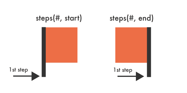
Difference btween steps start and end
I'll update this as I learn more about steps and how to best use them.
Do we need to start the animation right away? #
No, we can add delays to animations to make animations start after the page has loaded or create sequences of animations by delaying the starts of different animations to fit the needs of the project.
The animation-delay property controls the time between the element being loaded and the start of the animation sequence.
Let's take this two divs
<div class='boxes box1'></div>
<div class='boxes box2'></div>
And the following CSS where we perform the following taks:
- Create a class to style the boxes
.boxes - Set up the animation characteristics for our first element,
.box1 - Set up the animation characteristics for our second element,
.box2. Not that the animation for.box2will start 2 seconds after the animation for.box1 - We define the @keyframes for our move animation
.boxes {
  height: 100px;
  width: 100px;
  background-color: rebeccapurple;
}

.box1 {
  animation-name: move;
  animation-duration: 2s;
  animation-iteration-count: 5;
  animation-direction: alternate;
}

.box2 {
  animation-delay: 2s;
  animation-name: move;
  animation-duration: 2s;
  animation-iteration-count: 5;
  animation-direction: alternate;
}

@keyframes move {
  100% {
    margin-left: 1000px;
  }
}
If you see the example (Codepen: http://codepen.io/caraya/full/wgGdeO/) you will see that the second block starts 2 seconds after the first, everything else is identical for both boxes. I use the longhand animation syntax because I don't trust myself not to trigger the pitfalls from the shorthand syntax.
Do we have any control over pre and post animation state? #
There is a property for that :)
The animation-fill-mode property defines what values are applied by the animation outside the time it is executing.
That's a mouthful. Let's unpack what it really does and what values are available.
The attribute sets which values are applied before/after the animation. For example, you can set the last state of the animation to remain on screen, or you can set it to switch back to before when the animation began.
Possible values #
none is the default value. Only time when you'd set it manually is when you're working with Javascript to change it to or from none to a different value.
See the Pen animation-fill-mode v1 by Carlos Araya (@caraya) on CodePen.
Using forwards as the value of the animation-fill-mode property tells the browser that we want to keep the values of the last keyframe displayed after the animation has finished.
See the Pen animation-fill-mode v2 by Carlos Araya (@caraya) on CodePen.
A value of backwards, upon finishing the animation, gives the element the styles that it had before the animation began.
See the Pen animation-fill-mode v3 by Carlos Araya (@caraya) on CodePen.
In this particular example we did not define an initial value it will revert to the default values for the attributes we are animating (0px and the color assigned in the CSS declaration).
The final value we’ll look at is both. This value tells the browser to apply the effects of both forwards and backwards.
See the Pen animation-fill-mode v4 by Carlos Araya (@caraya) on CodePen.
This is another case when we don't have a beginning value so rather than take defaults and have to figure out what the results are it just takes the ending values and use those as the values for the animation.
can we play/pause an animation? #
Yes, you can but this is another property that is better used as a starting point for workig with Javascript in your animation. animation-play-state controls whether the animation is playing or not. It may also be useful when working with multiple animations that we want to play at different times when used in combinations with delays in animations.
The Pen below, based on Sara Soueidan CSS Reference Demo for animation-play-state adds a button that will toggle adding a .paused class where all we do is add animation-play-state: paused to pause the animation playback.
See the Pen animation-play-state v1 by Carlos Araya (@caraya) on CodePen.
Can we have more than one animation in a given element? #
Sure can. As long as we're mindful of the impact that CSS animations can have on overall browser performance (please don't blame me if 10 animations bring your page performance to the ground, you've been warned) you can attach multiple animations to the same element.
Using our standard box div element shown below
<div class='box' id='box'></div>And the following CSS to configure the element (size and initial colors) and the animations we want to attach to it. We set a comma separate list of values for all attributes except duration. In this case the browser will follow the spec and duplicate existing values until all the necessary values are filled.
In cases like this I prefer to use the longhand syntax. When working on the demo using shorthand I made so many mistakes that now I'm skittish and prefer the extra typing.
/* Defines the object we'll animate */
.box {
  height: 100px;
  width: 100px;
  background-color: rebeccapurple;
  animation-name: move, pulse;
  animation-duration: 5s, 2s;
  animation-iteration-count: 4, 4;
  animation-direction: alternate;
}
We ten define the keyframes as normal except that this time we define two of them rather than a single one like we've done so far.
@keyframes move {
  100% {
    margin-left: 1000px;
  }
}

@keyframes pulse {
  100% {
    background-color: blue;
  }
}
That's a lot of writing, is there a shorthand? #
Yes, but use it at your own risk. For anything other than simple animations the shorthand syntax can get really confusing really quickly (at least it did for me). The pseudocode for the shorthand is:
.foo {
  animation:
    <animation-name> ||
    <animation-timing-function> ||
    <animation-delay> ||
    <animation-iteration-count> ||
    <animation-direction> ||
    <animation-fill-mode> ||
    <animation-play-state> ||
}